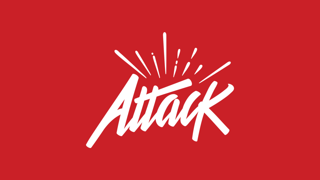
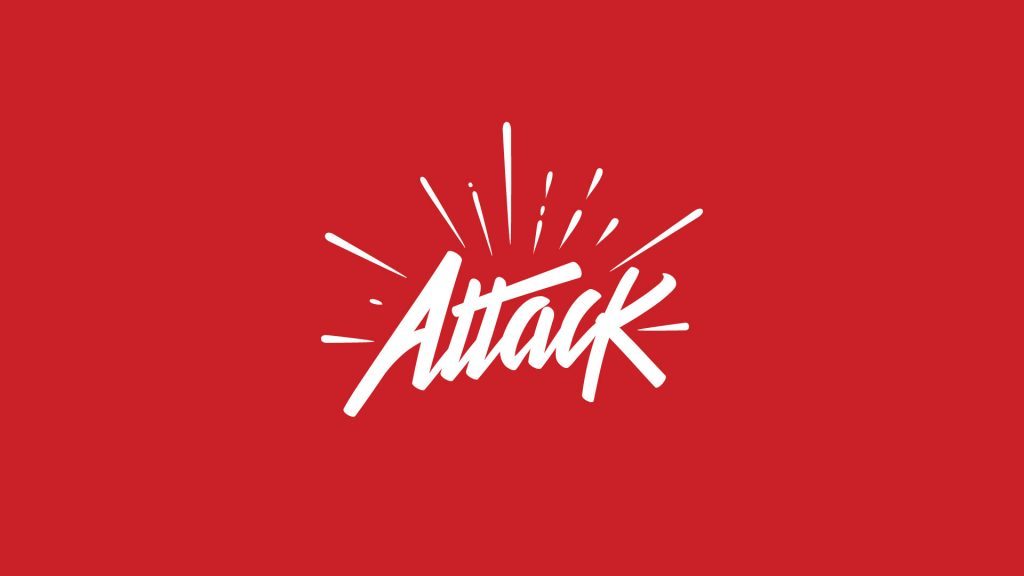
The Attack logo just needed a bit of a refresh. Rather than go to a complete redesign, I just did a quick nip and a tuck on our existing logo to remove some of the explosion radius.
I think it helped to shrink down some of the explosion lines and clip off a few on the sides. I feel it helps get across the point faster and doesn't obscure the rest of the logo mark like the old one did (you can still see that on the site for the time being, until I switch out for the new one).
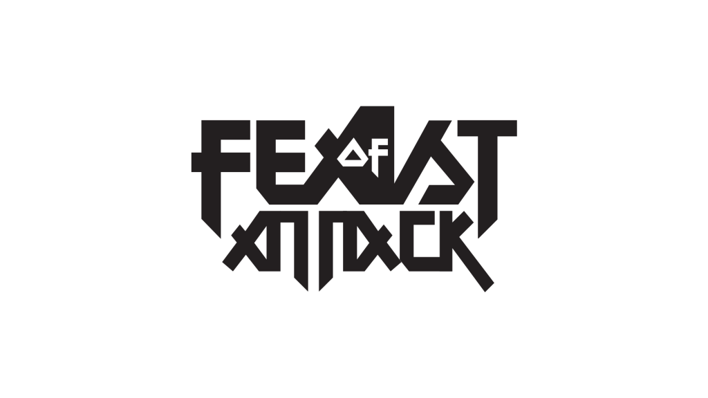
The word "Attack" itself is a bit controversial (with all the horrible attacks that you hear about in the news) and I've certainly had my second thoughts about it. Originally I was freelancing under the title Feast of Attack, which to me meant similar to eye candy for high energy motion.
That's always the kind of work that I've wanted to do, was the radical high-energy motion design. Back in 2005 when I first decided to pursue motion design as a career it was Bombay Saphire by Psyop and some of the motion projects of Qube Konstruct that inspired me.
Feast of Attack made sense for a little while, but then people confused it with a band name and it didn't exactly roll off the tongue. The logo at the time wasn't helping matters any, it looked like a metal band, for sure.
While I liked that look, I realized that a logo has to do more than just look cool to me, it needed to convey information to potential clients and was sending the wrong message, but had the right attitude.
Right around the time I started hiring the occasional freelancer and running small crews, it was distilled to Attack. It was one verb, one idea of intense energy, that could be a blanket for several forms of expression, not just motion design and video.
This name means more about the energy/kinetic movement of the work we do and the spirit in which we apply ourselves to the task. The idea is that we "attack" the problem, whether it's in terms of design, marketing, storytelling, or motion design. And yeah there's the awful stigma to the word that you hear every time a horrible thing happens in the news. For us, it kind of works in our favor.
Not many people will use this amazing action word for branding because of that, so that leaves the space open for us to take over. We're certainly up for the challenge.
Oscar Moctezuma, an awesome logo designer from Mexico, helped me take Attack from a font to a signature logo last July. Forever an obsessive tinkerer, I ended up adding some of the blast marks he used in another variation of the logo.
It should have been more considered, but work was ramping up then, and at that point I just needed a logo done. So, I've finally simplified the idea visually a bit more, locked it down to a more a signature/stamp combo which is really what I've been looking for all this time.
Let me know what you think about it in the comments.


It was a pleasure helping you out with the logo, it looks pretty amazing animated in your Reel!
Thanks Oscar, much appreciated! I hope business is booming for you! You do great work!
Comments are closed.