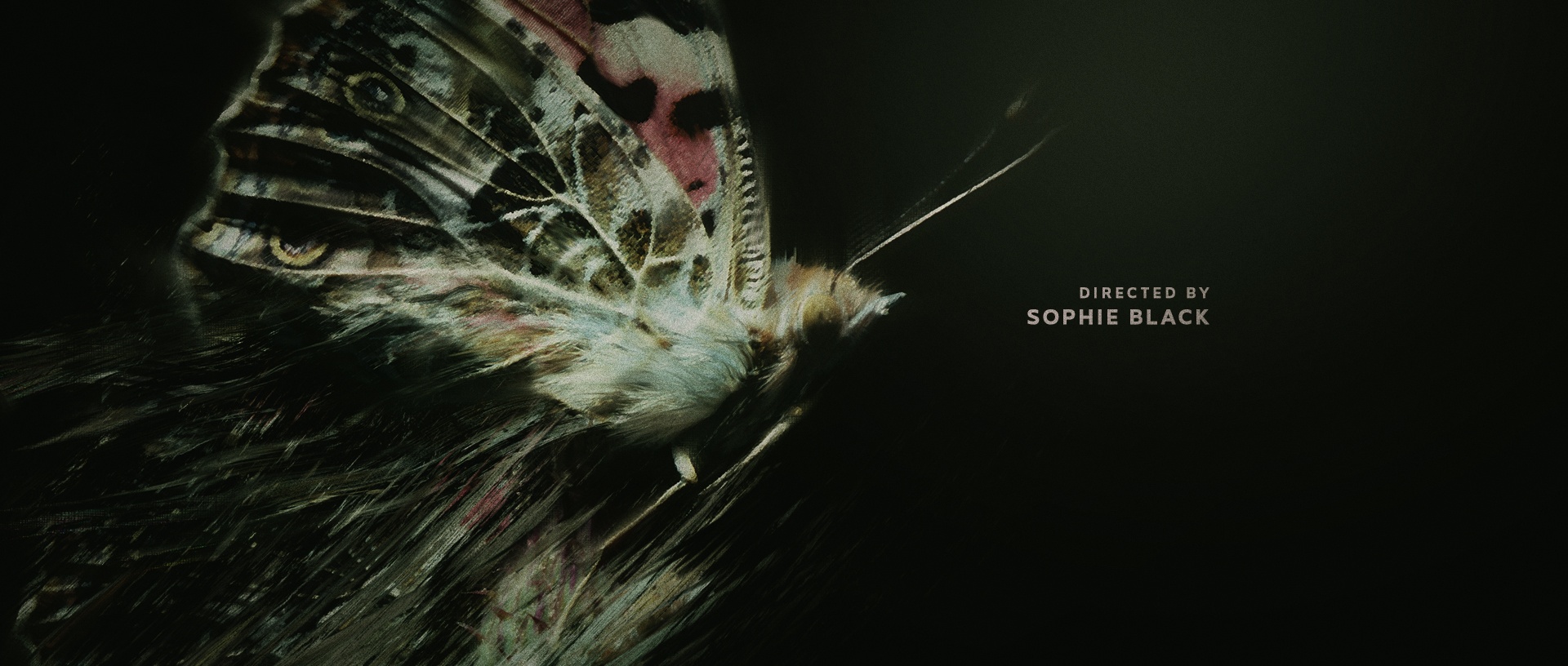
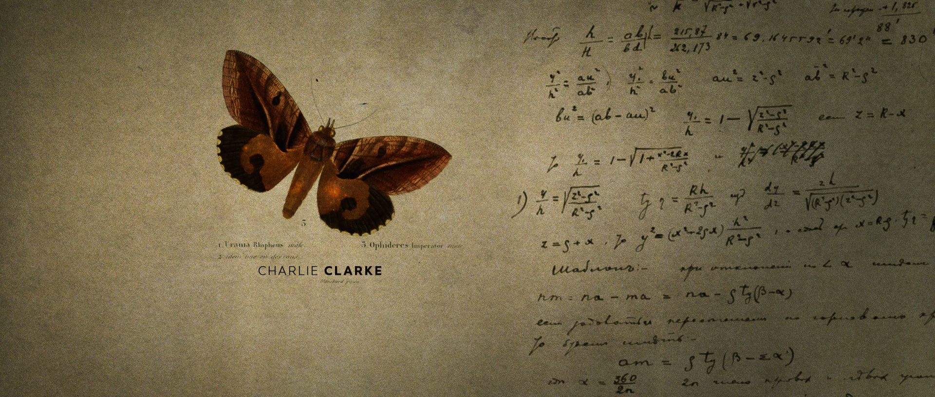
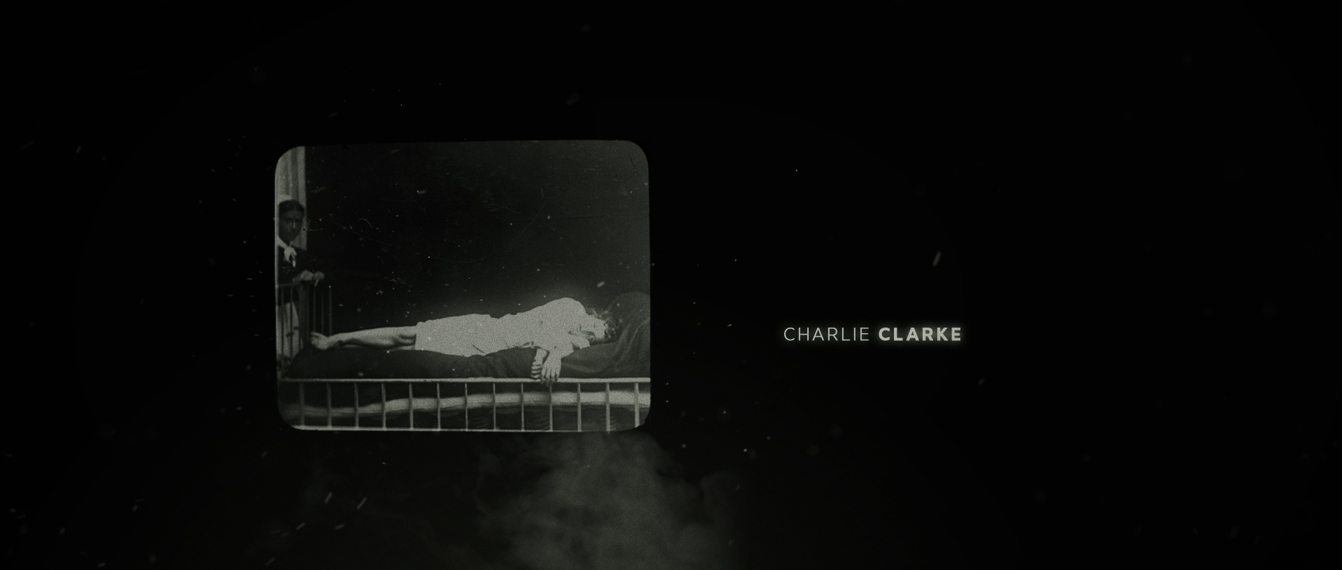
LEPIDOPTERIST - Main Titles
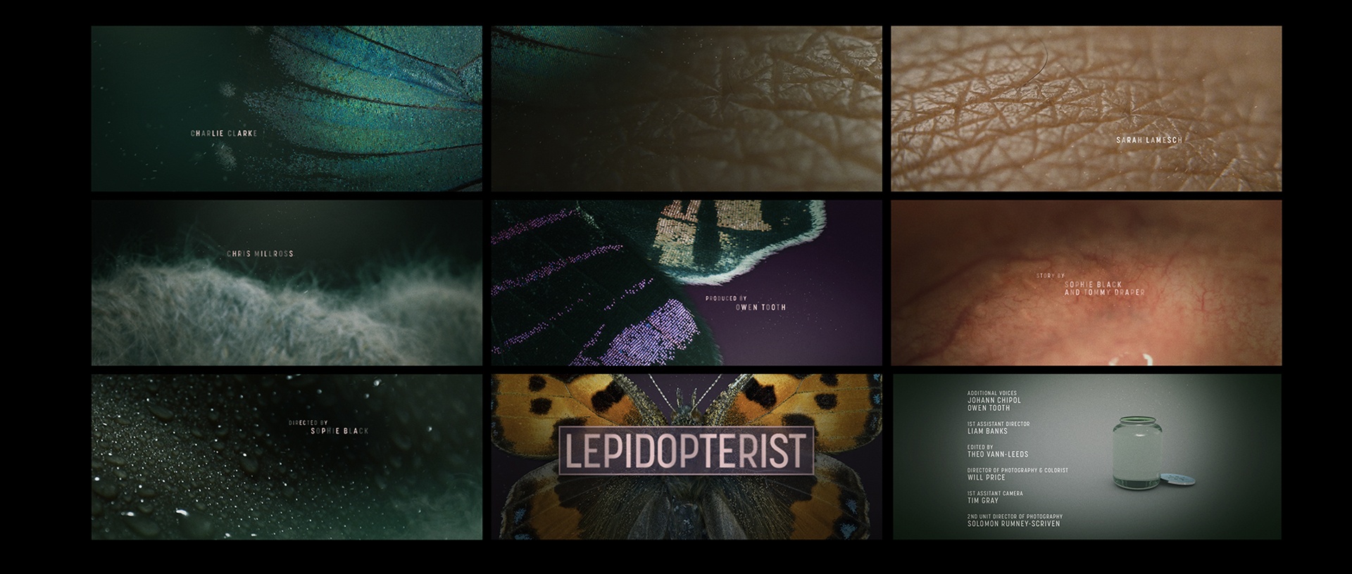
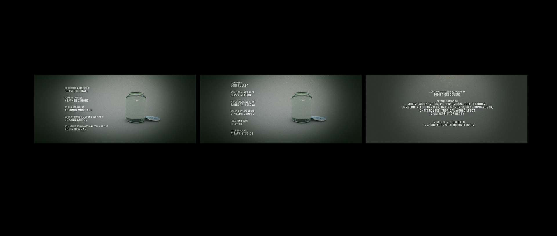
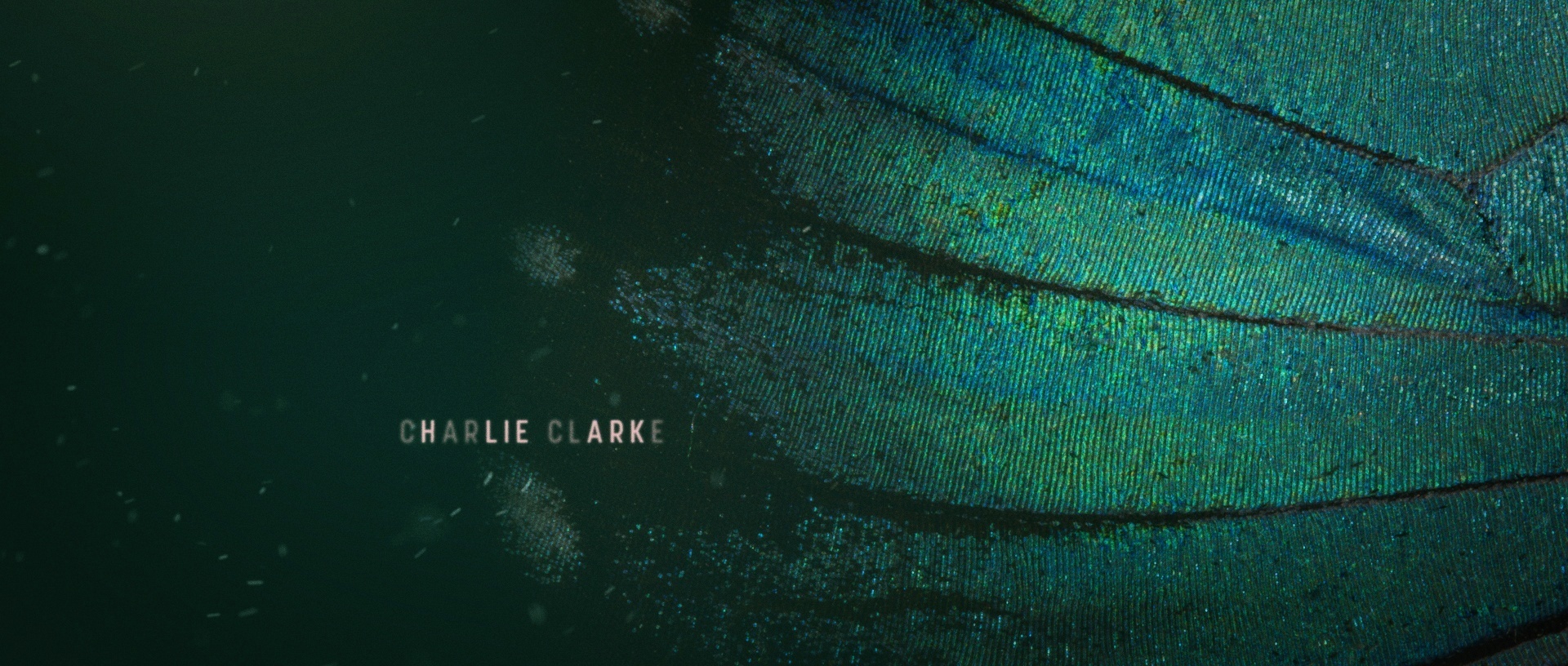
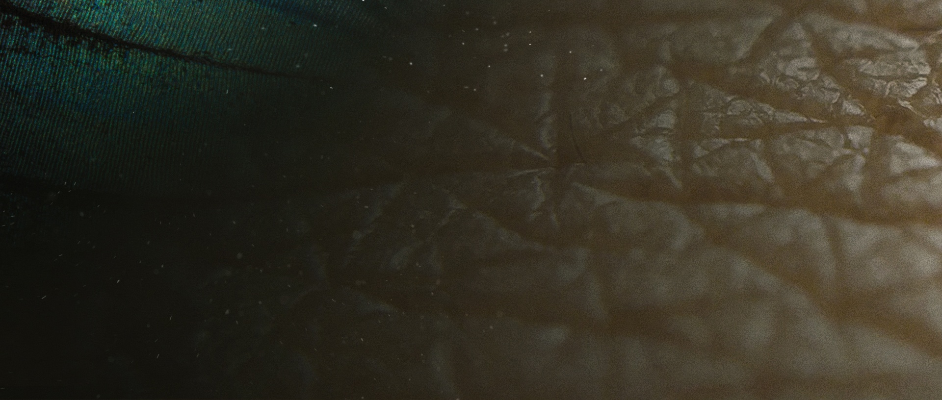
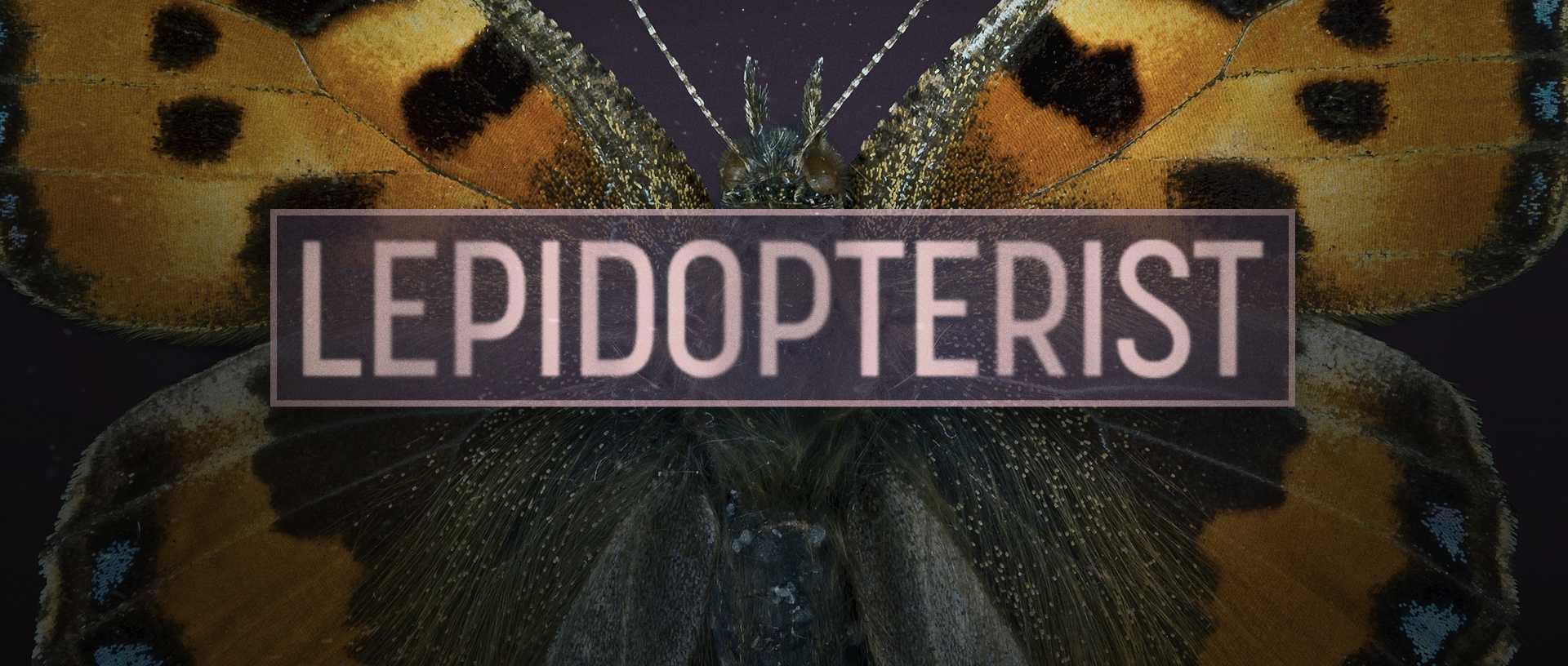
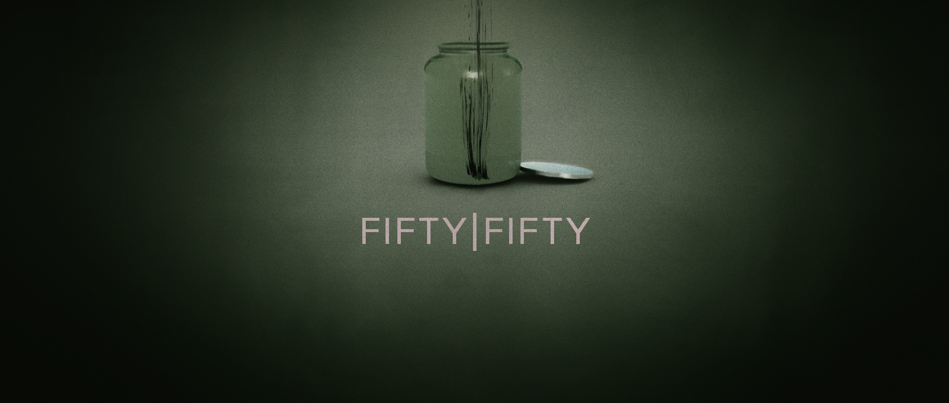
Lepidopterist: A thrilling sci-fi/horror short film directed by Sophia Black for Triskelle Pictures. Originally enlisted for VFX clean-up and tracking shots, we couldn't resist pitching a mesmerizing title sequence. The image gallery showcases our final storyboards, while the animation below brings it to life. Using a mix of internet-sourced stills and footage, along with After Effects magic and Cinema 4D neon effects, we crafted a captivating sequence. Check out early style explorations and false starts below. Originally titled "Fifty/Fifty," the film underwent a name change.
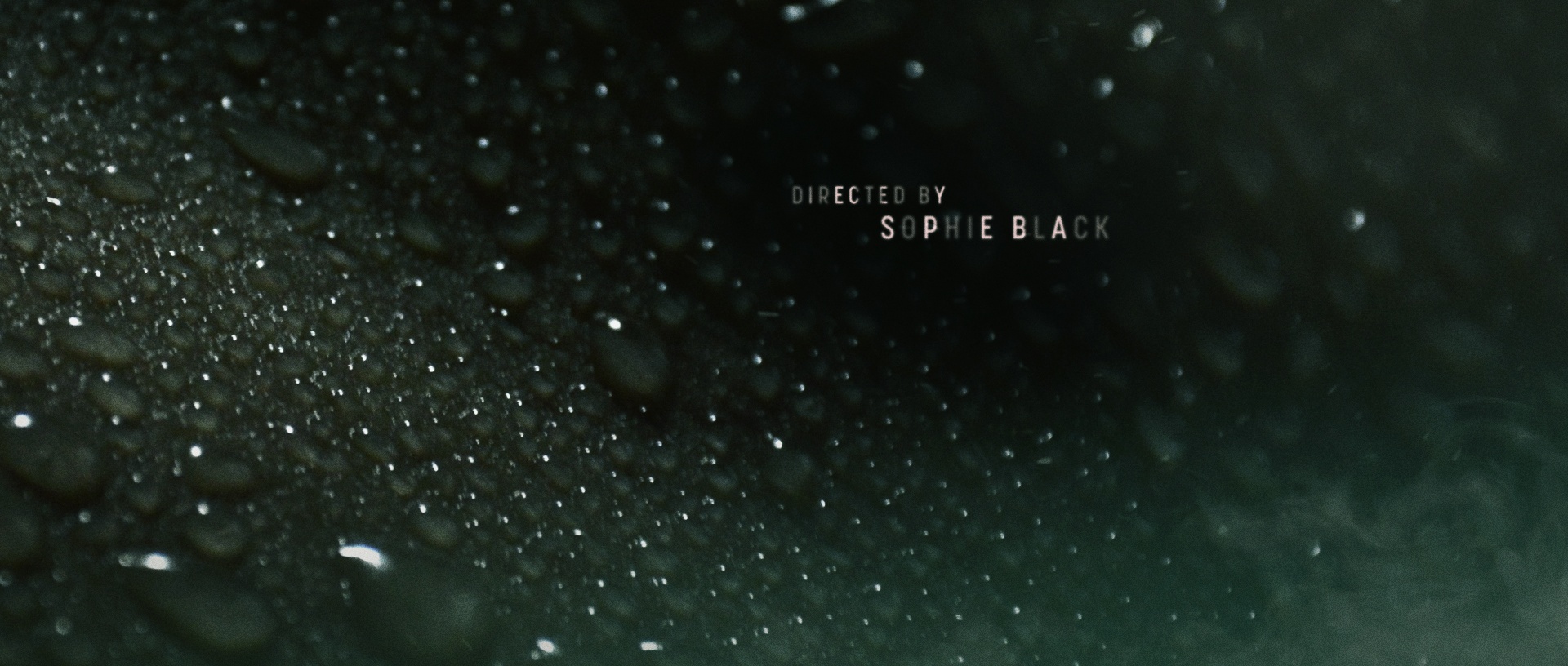
Client: Triskelle Pictures Ltd. | Sophie Black
Agency: Attack Studios
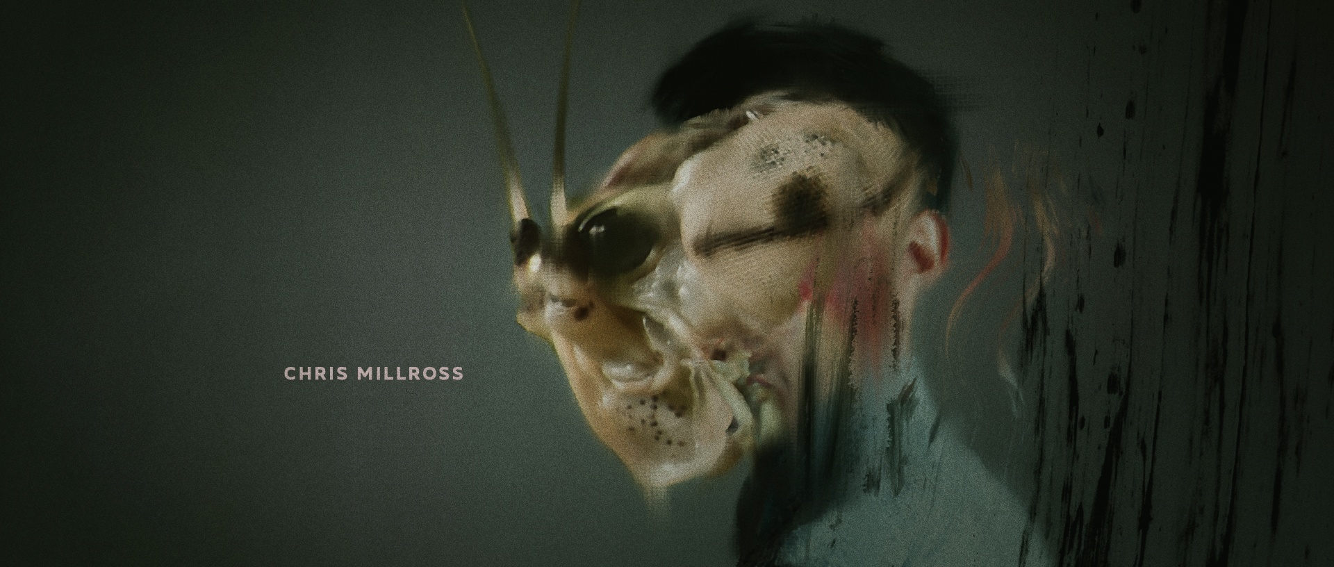
Role: Title Designer, Animation, Concepting, Art Direction
Skills: Cinema 4D, After Effects, Photoshop
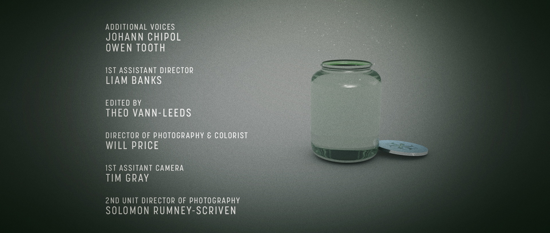
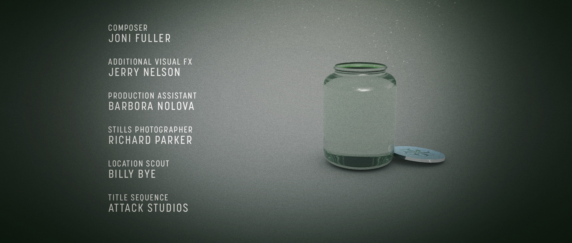
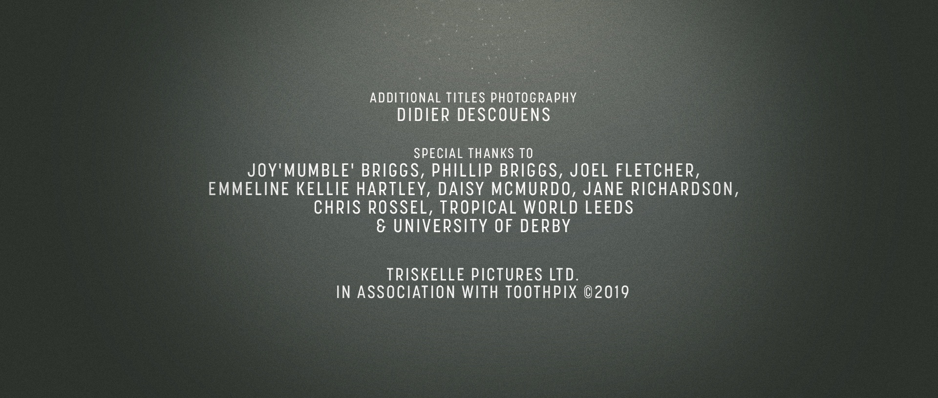
Additional Credits: Hidden Depths' (Barrie Gledden; Tim Reilly; Jeff Dale) Published by Audio Network; Didier Descouens, Photography.

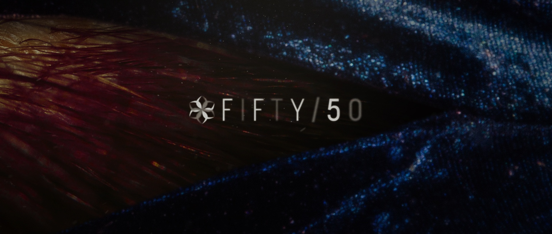
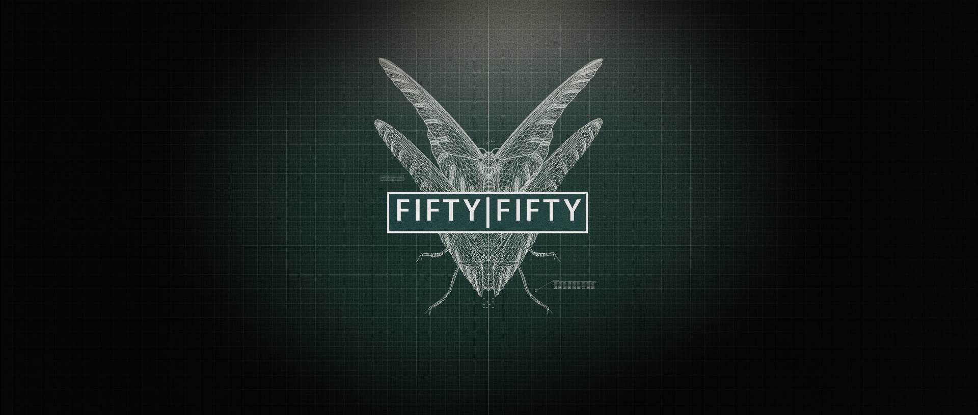
Fifty/Fifty - Early Titles Exploration
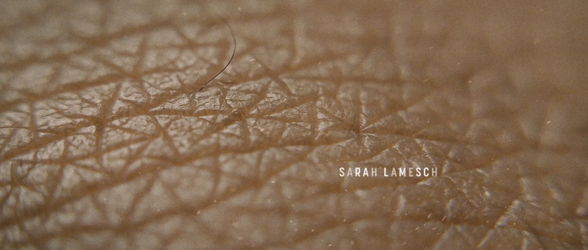
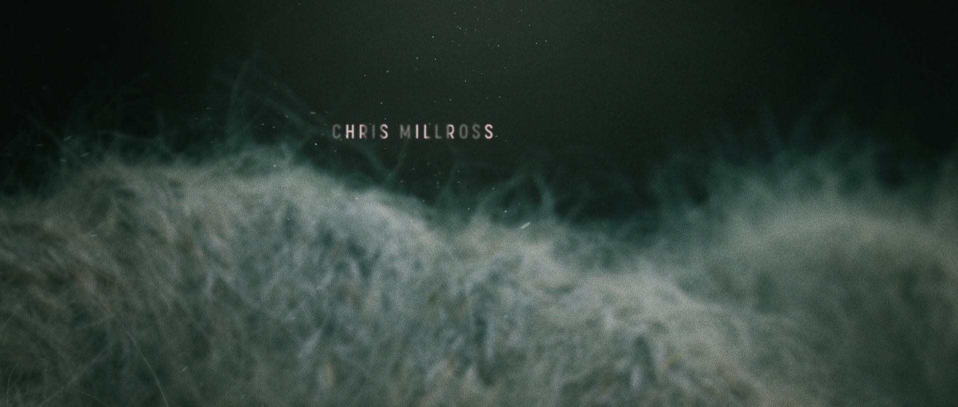
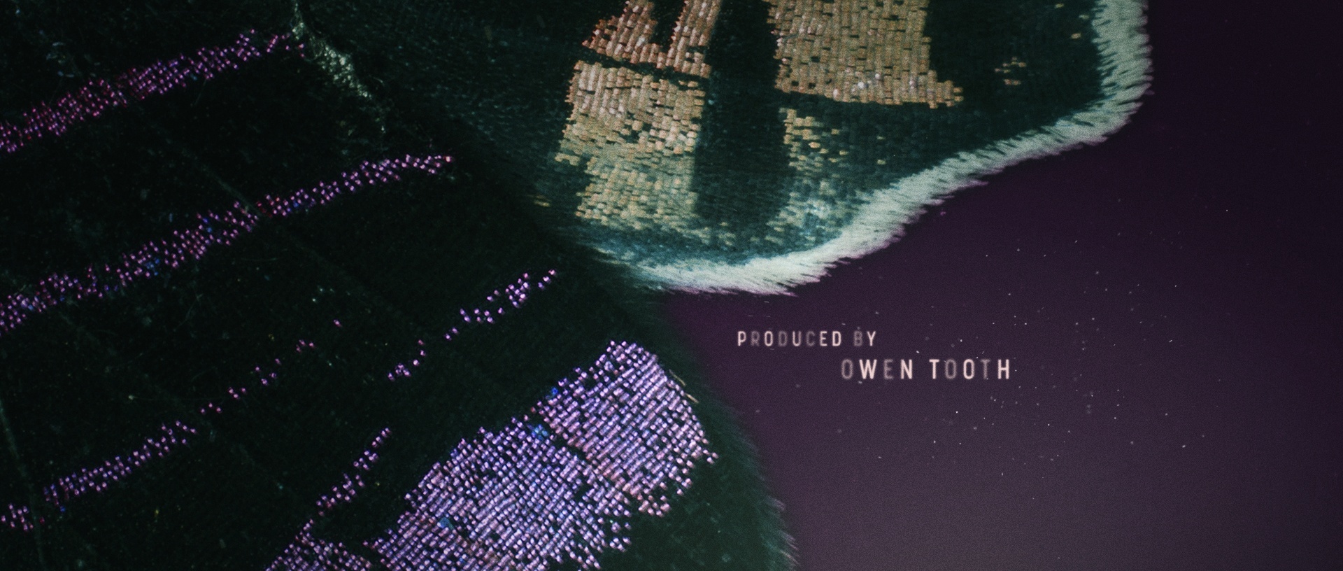
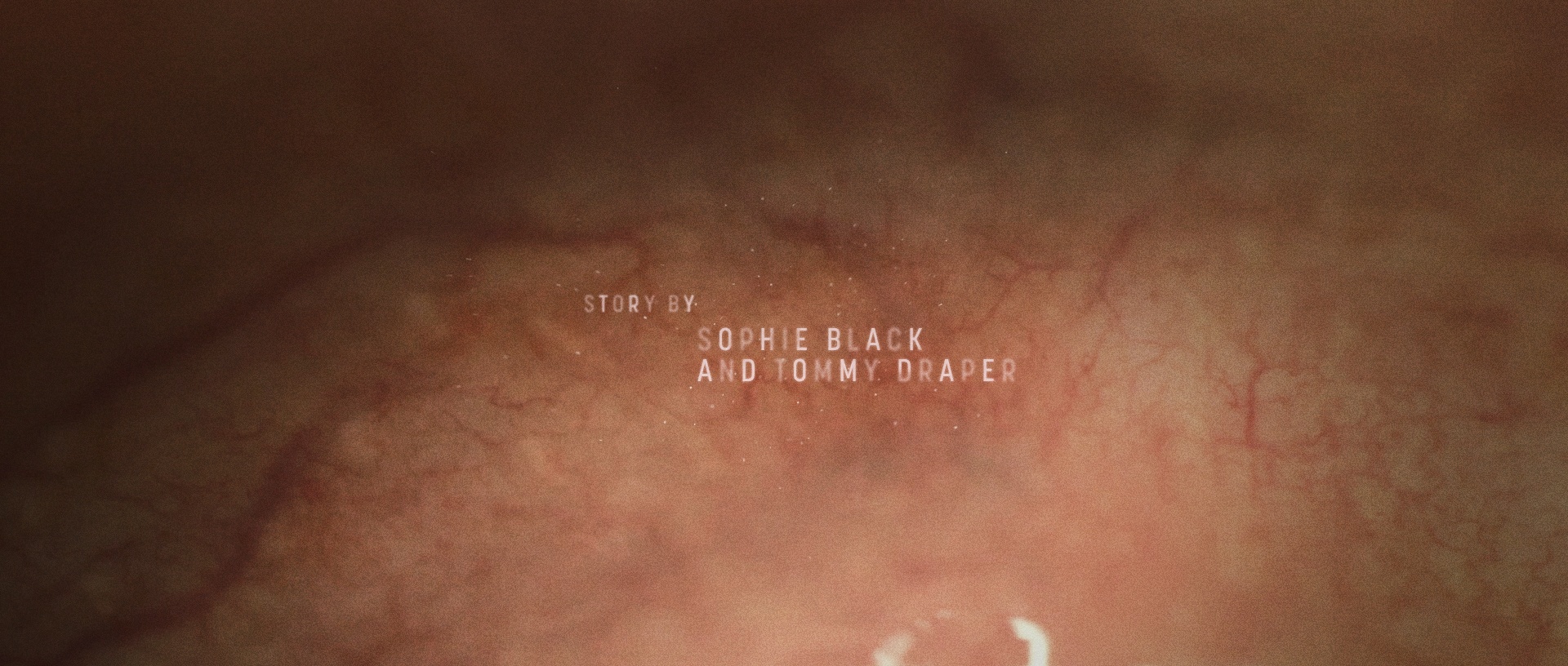
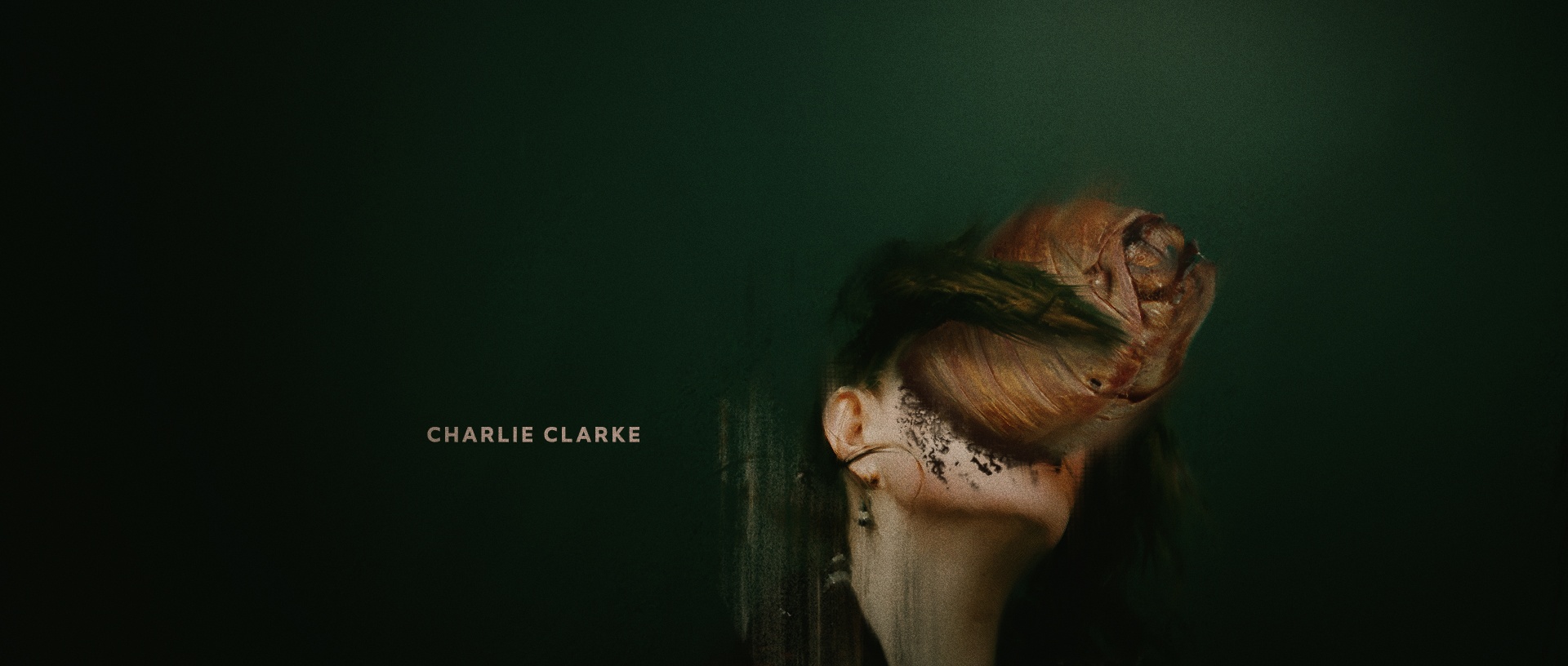
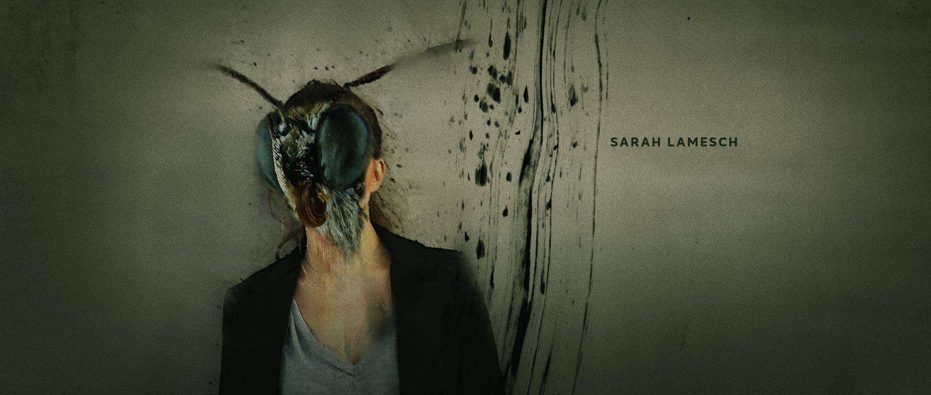
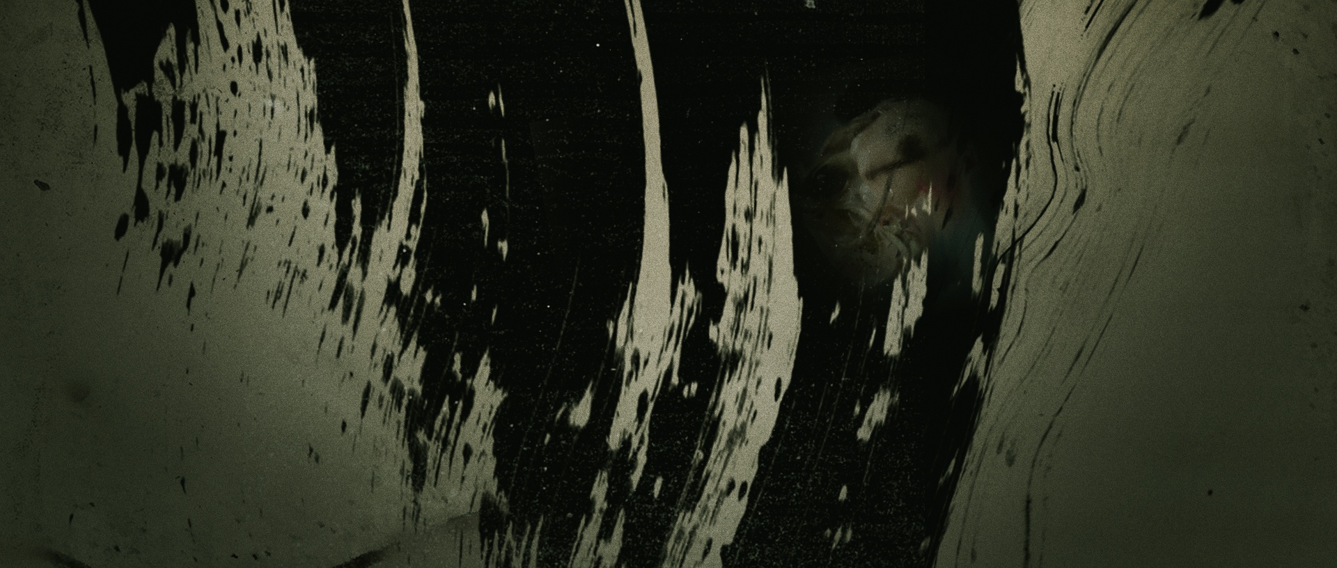
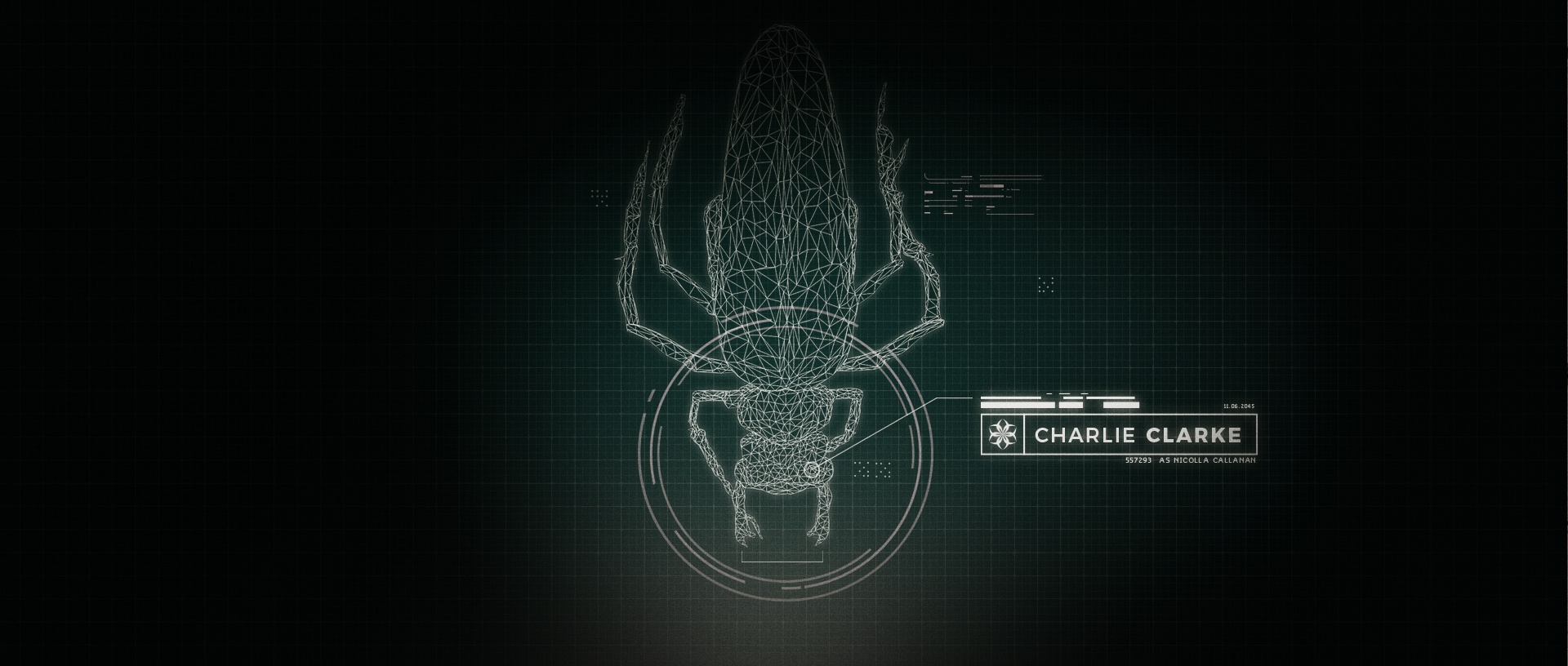
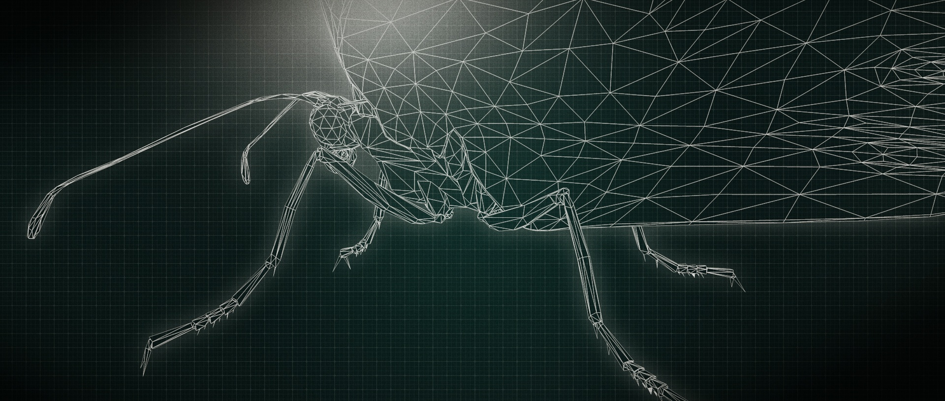
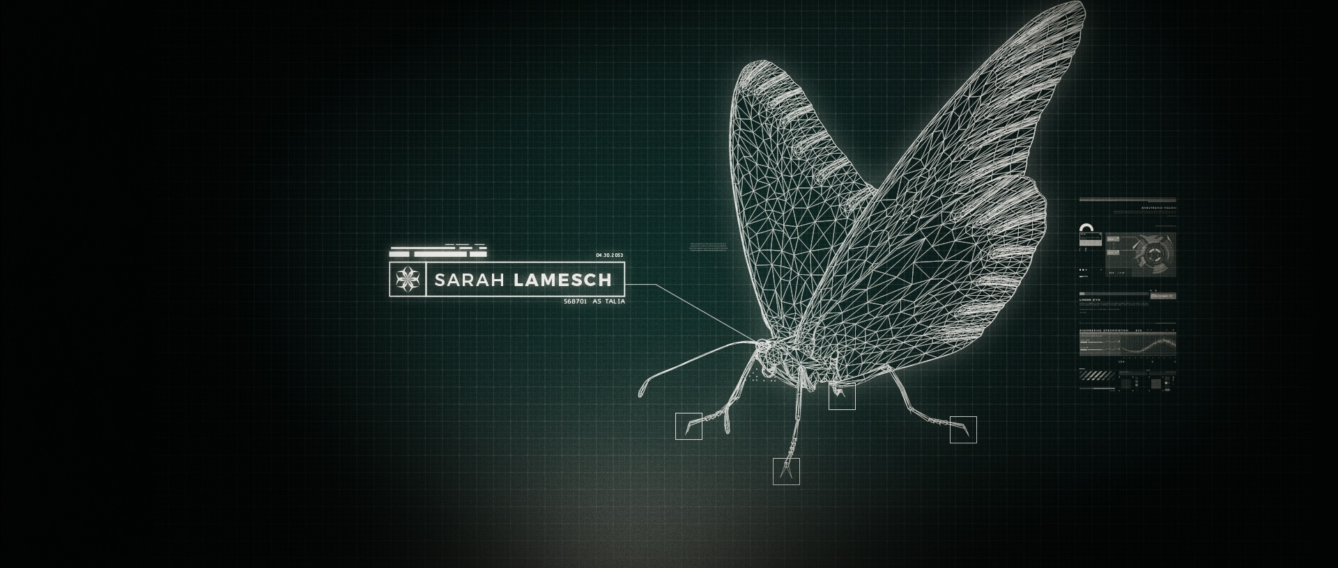
Our instincts were spot-on with this project, impressing the client with our creative choices. The macro photography style, featuring textural floaties and organic blurry randomized credits, perfectly captured the themes of mystery, transformation, and escape. We had a blast exploring various stylistic ideas, including a collage style and a folksy illustrated/vintage approach. However, we swiftly discarded them as we discovered countless similar titles in those veins. Next, we delved into the sci-fi angle, utilizing wireframe insect models and a striking green grid. Surprisingly, this direction felt overly symbolic and thematically limited. The journey of finding the perfect fit continued.
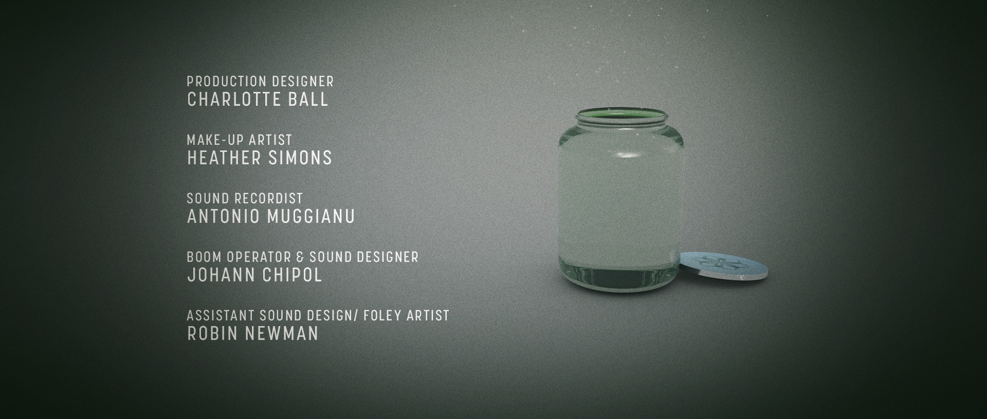
Inspired by Charlotte Caron's paintings, we embarked on a digital collage journey, simulating paint and incorporating brush strokes, smears, texture, and lighting. The jar, rendered in Cinema 4D, underwent the same stylized treatment. The director embraced the macro/textural approach, providing refined direction to capture their desired color palette—dreamy pale greens, fleshy orange, and vibrant purples. We explored several title designs but ultimately chose one that symbolized confinement and release. Excitingly, the film has been submitted to online festivals, offering everyone a chance to experience its cool and quirky essence.
2022 Update - We're thrilled to announce that the film has achieved remarkable success in festivals, earning 4 awards and receiving 8 nominations.
© Jerry Nelson 2021 | Attack Motion Design is a company registered and licensed in Chicago, IL USA.
© Jerry Nelson 2013 | Attack Motion Design is a company registered and licensed in Chicago, IL USA.
