Engagement and viewability are important metrics to measure when trying to launch a successful business video. They measure how much of the video that the viewer watches and if they interact with a call to action. Here are some character design tips to help your video become more immersive.
Some people measure each separately, but to me, they are interconnected. No one is going to click on your call to action if they don't finish watching your video. So with that in mind, here's a few quick tips on how to make the characters in your video a little more personable. An audience liking your characters and being invested in the story will increase engagement and put more money in your pocket.
Boost Engagement With Character Design Tips
1. Use the marketing demographics of your customer as the basis for the main character in your video
This should be a no-brainer, but it is surprising how often people neglect their main demographic. In these days of video overload, an audience is careful how they spend their time. They are far more inclined to watch a video that has a character they can identify with.
Avoid using stereotypes and anything that portrays your audience in a negative light. Start with the broad basics and then concentrate on small nuanced details that make a character relatable. Are they fashion-forward? Do they drink fancy coffee? Are they early adopters? Tech Savvy? Fine-tune your demo and come up with at least 3 visual representations that might portray them.
The results can often inform the set-up of your story. Pick the best one and then use that as a style guide for the rest of your characters. How do they fit into your main character's world?
2. Use props and other costume details to add visual interest to your characters
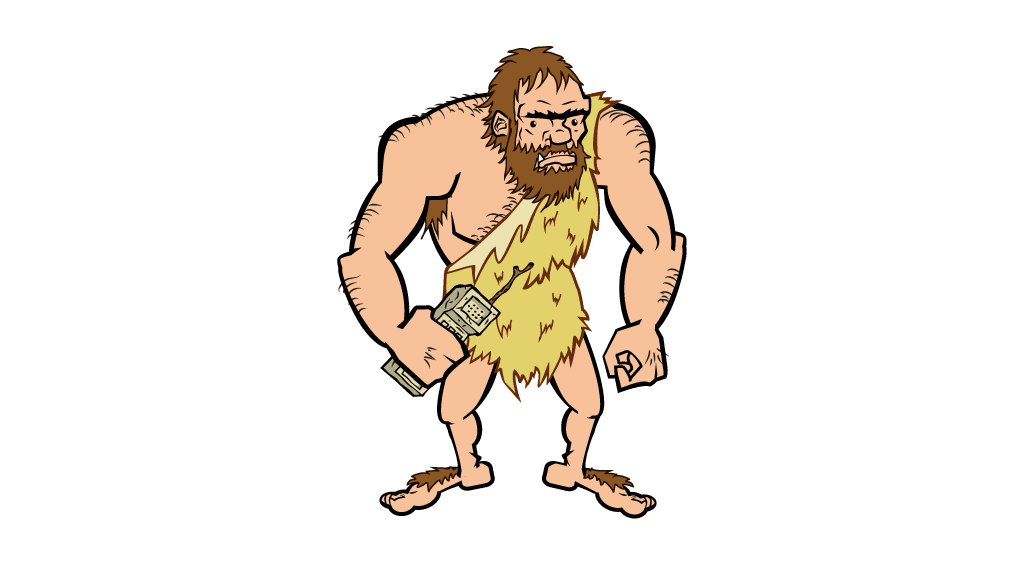
I designed a caveman character for a video as a visual metaphor showing the potential of technology evolution. The caveman had a little stone cellphone that used a twig for an antenna. As the video progressed, he evolved into a more sophisticated human. The phone went from a brick to a flip, to a smartphone.
Well designed props and details are a vital part of the story. It fleshes out the picture you are trying to paint for your audience. As the world you are showing them becomes more immersive, the audience becomes more invested in your message.
3. Silhouettes should be designed using basic shapes.
They will give you the visual cues to describe your concept art character and attitudes. Shape symbolism can be important in determining how the viewer reacts to your characters. Examples of Circles: appealing, good, cute, cuddly, endearing, friendly. Squares: dependable, solid, strong. Triangles: sinister, suspicious, villain, bad. Use the right combination for the characters in your video so the story is clear and easy to digest.
To learn more about building a character with shape language check out this course on Skillshare.
I have a great idea for a follow-up post that involves pairing physical attributes with symbolic and psychological personality associations. It's a pretty in-depth topic that dives into some behind the scenes secrets of truly bringing a character to life. For now, I hope that's enough to get you started and helps boost engagement for your video.
Don't forget to read: Character Design and Symbolism – An In-Depth Guide

Great post. I’m going through some of these issues
as well..
I’m glad you liked. If you have any questions I’m happy to help. Also, I went a bit more in depth with the follow up post on Character Design and Symbolism. You can check it out here: https://attackmotiondesign.com/character-design-and-symbolism-an-in-depth-guide/
Comments are closed.