This is just a quick little process walk-thru on how they made the Stranger Things title design, not a tutorial!
[pevideo id="1276"]
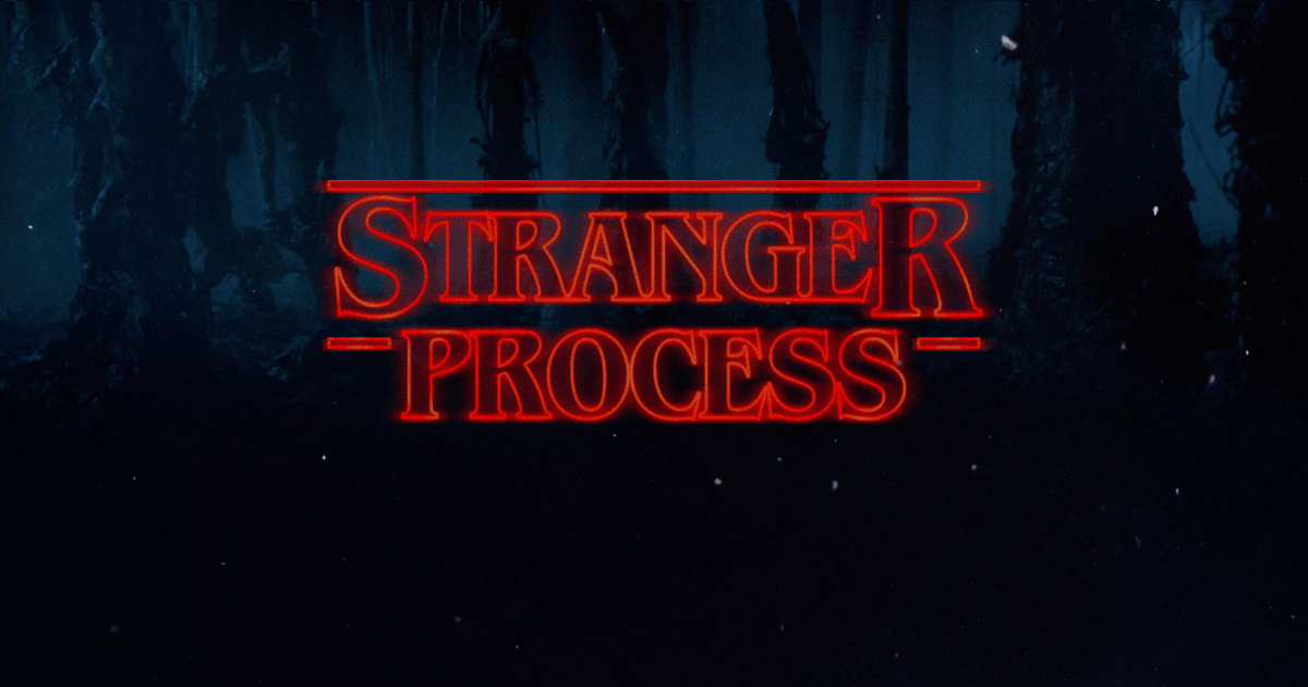
MakeItStranger has a Stranger Things title generator that I used for the graphic in this post. Also, please check out this video by Vox. It gives a great background on everything and dips its toes into some of the processes, but in a very vague way. If you don’t have time to watch, let me summarize for you.
Kyle Cooper’s Imaginary Forces was responsible for the titles on Stranger Things. Some of the other famous title sequences that they have made are Seven, Mad Men, Boardwalk Empire, Jessica Jones, and Dawn of The Dead Remake. They are known to combine frame by frame optical printing with digital effects and animation. This is no different.
[pevideo id="1282"]
R Greenberg and Associates heavily influenced this title design. They have worked on titles for The Dead Zone, Alien, and the Altered States. Several Stephen King book covers were referenced for the typography. The font they finally decided on is ITC Benguiat made in 1978 by jazz percussionist Ed Benguiat.
Ok now here's the cool process they used. They made a Kodalith of the final title layout. A Kodalith is basically like a reversed out transparency film. They filmed what it looked like when the light shined through the letters. They used physical references and animated the title digitally, that's why there is subtle flickering and shaking in the text.
Read more: Best Show Opener Title Designs
Here are a few notes I made on the title design process. Now if I had to figure out how exactly they did, they probably filmed it a few different ways for each shot. Some with subtle pans and others locked down so they have a variety to choose from.
On the close up letters moving towards and away from each other they probably had a different Kodalith that had a bit more space in between. That way when they animate the letterforms there’s not too much bleed over with the light and they can get that nice natural glow fade that they have.
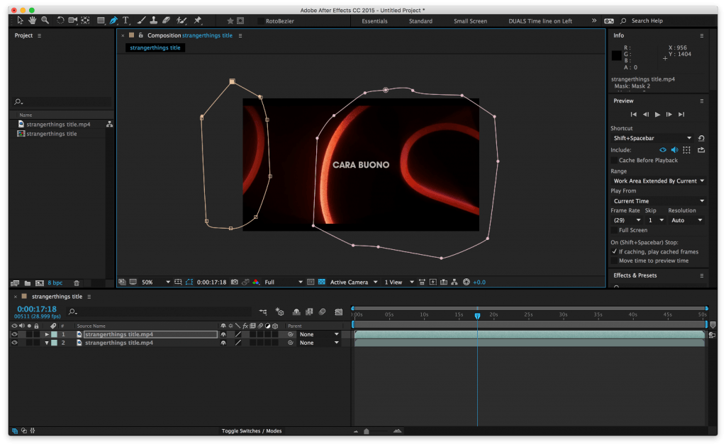
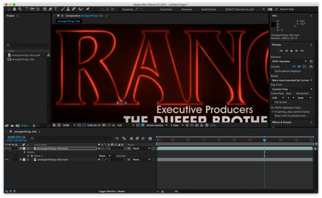
The footage is just probably animated in After Effects with a mask around each letterform area with a slight feather to the mask. The keyframes look linear to me, but there might be subtle easy ease and they maybe did a slight time stretch to reduce flickering.
If they animated it with the mask, there's no doubt a slight adjustment layer glow to kind of seal it all into the composite. Also, some of it might be recreated on the close-ups if then couldn't get the animation to look right. Trapcode 3D-stroke or Video C0-Pilot's Saber might be used.
Then they could add in as much or as little glow as they wanted and just use the footage they shot as a reference.
Reel Epic does a great tutorial on this w/ Saber.
For the final reveal, it’s probably the same thing. A mask around each letter slowly drifting into place and an easy mask reveals on the bars. They had to mask out little things like the bridge between the R and A where it connects. If you notice it just quickly pops off when they merge.
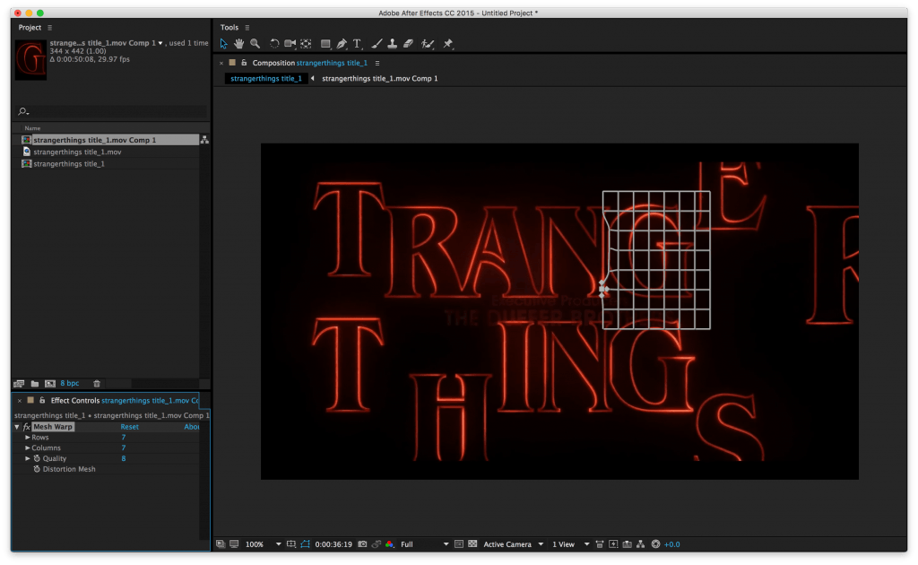
The G is a little trickier when it flattens against the N. If I was me I would have probably key a distortion mesh to straighten out the bend in the G and use a splice straight line from one of the other letter forms that look similar to the G (it look like they used the far side of the N) as a patch if it can seamlessly blend in. Then it fades out with a dark vignette from the edges going in.
The individual name titles are just a light gray and have a quick 5 frame fade-up and a 15 frame dissolve at the end. The kind of change to red towards the end and this can be done with a simple color keyframe on the text to match that deep red, it looks like it kind of happens during the 15 frame dissolve. It might be 5 to change to red, 10 to fade out.
Keep in mind these are just some notes on how you could go about doing these titles. They might have used other techniques and embellishments here and there. I'm just making some observations because I love the show and the title sequence.
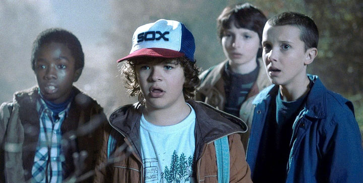
Plus you know Dustin is probably a White Sox fan, and they had to take that logo off his hat for legal reasons. I mean, look at the colors ... and he's from Indiana, which is a stone's throw from Chicago. No wonder that kid is smart as shit! I was happy to add that logo back in. Go, Sox!
[…] nods to the iconic 80s horror/sci-fi genre score, makes this piece one of the most beloved of 2016. Check out our article on the making of Stranger Things titles […]
Comments are closed.