This is a quick tip on how to get precise timing and positioning by double-clicking your keyframe in After Effects. You can view your playhead offset from the keyframes while adjusting the values to get your timing just right. Read more
March 20, 2025 — Comments are off for this post.
After Effects Tips: Precise Timing With Key Frame Double-Click
November 16, 2023 — Comments are off for this post.
2D Motion Software Showdown: Comparing Animate, Rive, After Effects, Cavalry, and Toon Boom
The choice of 2D motion software stands as a pivotal decision, capable of either smoothing the creative workflow or introducing complexities that may potentially disrupt the artistic process. It's not merely a tool; it's the backbone of your digital canvas, influencing how seamlessly ideas can be translated into vibrant animations. The stakes are high – a well-chosen software elevates efficiency, allowing artists to effortlessly bring their vision to life, while an ill-fitting one can introduce obstacles, impeding the natural flow of creativity. In this comprehensive comparison, we'll pit five animation powerhouses against each other: Adobe Animate, Rive, After Effects, Cavalry, and Toon Boom Harmony. We'll delve into their unique features, use cases, and provide a pros and cons list to assist you in making an informed decision.
After Effects: The Industry Workhorse
After Effects is pretty much my go-to app. It can pretty much handle anything I throw at it and it pairs great with Cinema 4D. I've been using it for so long (since version 3!) and have such a deep knowledge of the program's ins & outs and plugins to extend it. It can be a pain in the ass, for sure, but Adobe has come a long way in making this a much more reliable, stable, fast and robust app. The newest version is one of the best that's ever been put out by Adobe, making this a tough one to beat.
Pros:
- Comprehensive Toolkit: After Effects is an all-in-one solution for animation, visual effects, compositing, and motion graphics, enriched by a vast library of plugins and presets.
- 3D Capabilities: It's ideal for creating complex animations with 3D integration.
- Expression Language: Offers powerful automation and control capabilities through expressions.
Cons:
- Learning Curve: Its extensive feature set can be overwhelming for newcomers.
- Resource-Intensive: Rendering complex animations can be time-consuming.
- No interactive capabilities.
- No responsive or dynamic layouts
Best For: Professional video production, visual effects, and motion graphics projects.
Adobe Animate: The Veteran Performer
If need interactivity and want to stay within the Adobe ecosystem then Animate is your app. Animate used to be Flash until that got killed in favor of a more native web experience. Animate is a great tool to help with frame-by-frame animation. However, there are other programs that can handle that in a less clunky way. I think for some this is just the go-to because of legacy reasons and a robust community. I haven't used it for frame-by-frame stuff in years and it mostly gathers dust on my box.
Pros:
- Versatility: Adobe Animate caters to both vector and raster animations, making it a versatile choice for a wide array of projects.
- Interactivity: It boasts robust scripting capabilities, ideal for crafting interactive web content and games.
- Dynamic Reformatting: Animate excels in adapting content to various screen sizes, ensuring a responsive design.
Cons:
- Learning Curve: Its feature-rich interface may be intimidating for beginners.
- Resource-Intensive: Creating complex animations can demand substantial system resources.
Best For: Web games, interactive web content, and projects requiring responsive design.
Rive: The Modern Vector Maestro
Build interactive animations that run anywhere. Blazing fast. Tiny size. Those are the Rive taglines. It's pretty much like Figma but with animation capabilities. I found the animation a bit on the basic side, but getting into the interactive part with the State machine opens this up to a whole new world of interactivity. This feels like the future that Flash promised but was never really able to deliver on. As advertisement is going omnichannel, along with interactivity being a must-have, this app is poised to be huge because it can be delivered anywhere. Check out this video Joey Korenman chats with Joe Nash talks the future of 2d motion design with Rive: https://www.youtube.com/watch?v=UtkzJLvWj5c&t=4298s
Pros:
- Vector Animation: Rive is perfect for creating smooth, vector-based animations, particularly suited for an illustrative approach.
- Interactivity: Tailored for crafting interactive animations in web and mobile applications.
- Cross-Platform Compatibility: Seamlessly integrates into various platforms, simplifying multi-platform development.
- Favored by Figma
Cons:
- Limited 3D Capabilities: It may not be the best choice for projects demanding extensive 3D integration.
- Smaller Community: Fewer online resources and tutorials compared to established software.
- Animation is a bit basic and not as easy to fine-tune.
Best For: UI/UX design, interactive web and mobile app animations, and vector-based 2d motion graphics.
Cavalry: The 2.5D Marvel
This is the animation app FUBU. For animators By Animators. Realtime, data-driven, and procedural, it has built-in tools that are similar to a lot of AE scripts like Joysticks & Sliders, Limber/Rubberhose, Motion 4, and physic dynamics. The thing that's holding this app back I think is that the market already had this toolset by plugins & scripts already in After Effects... so it's like why learn something new? Most animators I know played with it for a few weeks then went back to doing what they knew. I think this could be an interesting app for social and for infographics. There's a lot of potential here but I don't think it's enough unless they offer something new that nobody else really does. I think responsive layouts are a good start and if they incorporate the runtime capabilities of something like Rive it could be a real contender.
Pros:
- Deformer Tools: Cavalry excels in non-destructive shape transformations, ideal for dynamic character and object animations.
- Parallax and Depth Effects: Perfect for adding depth and dimension to 2D scenes with parallax effects.
- Node-Based Animation: Simplifies complex 2d motion and allows real-time adjustments.
- Responsive Layouts
Cons:
- Limited 3D Capabilities: Not the best choice for extensive 3D work.
- Newer Software: A smaller user base translates to fewer resources and tutorials.
Best For: 2.5D animations, character animation, and projects requiring a node-based workflow.
Toon Boom Harmony: The Animation Production Powerhouse
Pros:
- Frame-by-Frame and Cut-Out Animation: Harmony shines in traditional frame-by-frame animation as well as cut-out animation.
- Rigging, bones, and Puppet Animation: Offers advanced rigging tools for character animation, making it a top choice for animation studios.
- Drawing and Painting: It includes powerful drawing and painting tools for artists.
Cons:
- Learning Curve: Harmony's extensive feature set can be complex for beginners.
- Cost: It's a professional tool, which means it comes with a higher price tag.
Best For: Animation studios, traditional and cut-out animation, character rigging, and advanced animation techniques.
Conclusion: When you're talking about 2D motion, selecting software goes beyond features; it plays a crucial role in shaping an environment that fosters unrestricted artistic expression, with each stroke contributing to the smooth flow of the creative process. The ideal animation software depends on your project's specific needs and your familiarity with each tool. As an animator, I have to make very careful choices about what to invest in my time for learning software. Part of that is figuring out the work I want to do and the other part is figuring out where the market is trending. To summarize, choose Adobe Animate for versatility and legacy studios that use it, Rive for modern vector animations and interactivity, After Effects for comprehensive video production and visual effects, Cavalry for 2.5D animation and node-based workflows, and Toon Boom Harmony for professional animation production, especially in studios. Tailor your choice to your project's requirements, and you'll be well on your way to motion design Valhalla.
November 1, 2023 — Comments are off for this post.
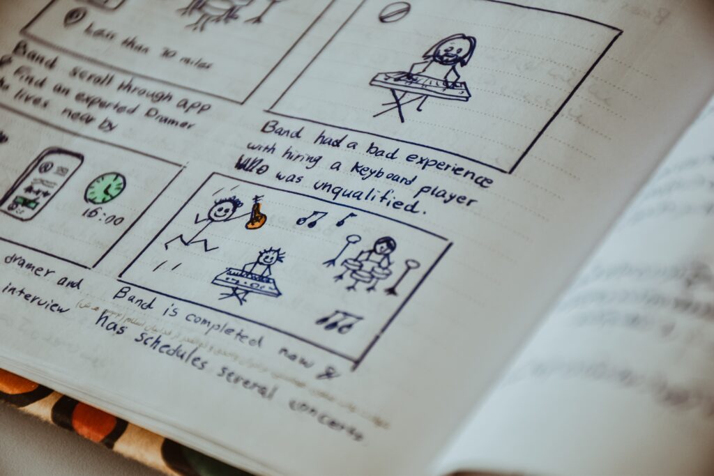
Plan and Storyboard Your Video Project
Planning and storyboarding are crucial steps in creating a successful video project, whether it's a short film, documentary, promotional video, animated film, motion graphics, or any other type of video content. Here are some steps to help you effectively plan and storyboard your video project, along with insights into different types of storyboard shots and camera angles:
-
Define Your Objectives:
- Start by clarifying the purpose and goals of your video. What do you want to achieve with this project? Who is your target audience? What message do you want to convey?
-
Research and Conceptualize:
- Then research similar videos or content to get inspiration and understand what works. Develop a clear concept for your video, including the key themes and ideas you want to explore. In order to do so, I like to create a mood board on Pinterest to be the North Star that guides the project.
-
Create a Script:
- Meanwhile, write a script that outlines the dialogue, narration, and action in your video. A well-structured script will serve as the foundation for your storyboard. The script should be about 80% locked (hey, there are always rewrites, no worries) before beginning on the storyboard.
-
Identify Key Scenes and Shots:
- Afterwards, break down your script into key scenes and shots. Think about the visual elements, camera angles, and locations needed to tell your story effectively. I like to do this with a split script. This splits the script into a two-column document. On one side is all the dialogue from the scenes and shots, and on the other side is the shot description, action direction, and storyboard notes.
-
Create a Shot List:
- Develop a shot list that specifies each shot you plan to capture. Include details like the camera angle, shot type (wide, medium, close-up), camera movement, and any necessary props or actors.
Types of Storyboard Shots:
- Wide Shot (WS): This shot includes a wide view of the scene, capturing a broad area. It's great for establishing a location or showing a character's position in their surroundings.
- Medium Shot (MS): A medium shot focuses on the subject from the waist up. It's often used for conversations and showing more detail while still providing context.
- Close-Up (CU): A close-up shot frames a specific part of the subject, like their face. It's used to emphasize emotions, reactions, or details.
- Extreme Close-Up (ECU): Obviously, this is an even closer shot, often focusing on a specific feature, like an eye or a hand.
- Over-the-Shoulder Shot (OTS): This shot is taken from behind one character's shoulder, capturing the perspective of another character in the scene.

-
Shot Order:
- The typical order of storyboard shots for a scene, starting with a wide shot, often follows a progression that moves from a wide view to progressively closer and more detailed shots. For an example, here's a brief description of the common sequence:
-
Wide Shot (WS):
The scene opens with a wide shot to establish the location and provide context. It shows the overall setting and the placement of characters and objects.
-
Medium Shot (MS):
After the wide shot, a medium shot is used to focus on the characters or subjects within the scene. It provides a closer view while still showing some background.
-
Close-Up (CU):
Following the medium shot, close-up shots are used to emphasize the characters' emotions, reactions, or specific details. These shots create a stronger connection with the characters.
-
Extreme Close-Up (ECU):
In some cases, an extreme close-up may be employed to highlight a particular facial expression, gesture, or object with great detail.
This sequence, starting from a wide shot and moving closer to the subjects, is a common storytelling technique to draw the viewer into the scene, establish context, and create emotional engagement. However, the specific shot progression may vary based on the director's creative choices (or yours) and the requirements of the scene.
-
-
Storyboard:
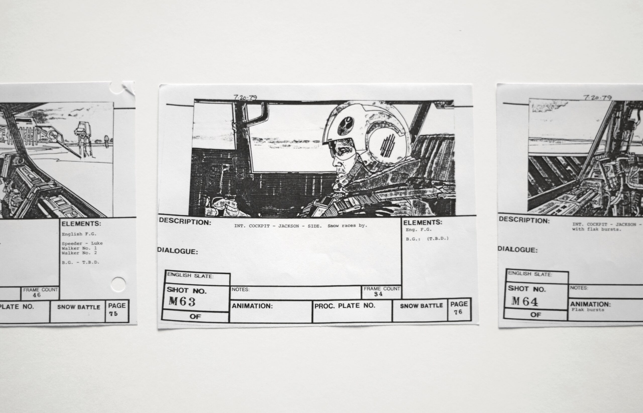
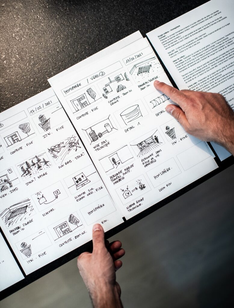
- Storyboarding is the visual representation of your video's shots and scenes. You can use paper and pencil or digital tools to sketch each frame. Include notes or descriptions for each frame to convey the action, dialogue, and any important details.
Types of Camera Angles:
- Eye-Level: This is the most common angle, and it presents the subject as equals. It's neutral and often used for straightforward storytelling.
- Low Angle: Shooting from a lower point, this angle makes the subject appear larger and more dominant. It can convey power or superiority.
- High Angle: The camera is positioned above the subject, making them appear smaller and more vulnerable. It's often used to show weakness or submission.
- Dutch Angle (Canted Angle): The camera is intentionally tilted, creating a sense of imbalance or unease. It's used to evoke tension or disorientation.
- Bird's-Eye View: This is a top-down perspective, offering an overview of the scene. It's used to show the entire layout or create a feeling of detachment.

-
Developing a storyboard frame:
- Starting with a thumbnail sketch and ending with a detailed sketch that includes basic lighting, involves a step-by-step process. Here's a brief guide on how to do it:
-
Thumbnail Sketch (Thumbnailing):
- Begin by creating a small and rough thumbnail sketch of the scene. This initial sketch should be quick and simplified, focusing on the basic composition, camera angle, and placement of key elements (characters, props, etc.). It's meant to be a quick visual brainstorming stage.
-
Frame Structure:
- Decide on the frame's aspect ratio and proportions (e.g., 16:9 for standard video, 1.85:1 for film). This will determine the shape of your frame and how the visual elements fit within it. Within your chosen frame dimensions, draw a rectangular box to represent the viewfinder or screen. This box outlines the area you'll work within for your detailed sketch.
-
Layout and Composition:
- Use your thumbnail as a reference to refine the composition. Place the main elements (characters, objects) in the frame, considering their positions and interactions. Ensure a clear visual flow that tells the story effectively.
-
Camera Angle:
- Decide on the camera angle (e.g., eye-level, high-angle, low-angle) that best conveys the desired emotion or perspective for the scene. Indicate this angle within the frame.
-
Basic Shapes and Lines:
- Start by sketching basic shapes and lines to represent the key elements in the scene. Use simple shapes to represent people and objects. This helps establish their positions and movements.
-
Lighting and Shading:
- To add basic lighting to your sketch, consider the light source's position in the scene. Use hatching or shading to indicate areas of light and shadow. This will create depth and dimension in your frame.
-
Detailing:
- Gradually add more details to your sketch. Focus on refining the character's features, adding textures to objects, and incorporating any essential background elements. Pay attention to facial expressions and body language for characters.
-
Additional Notes & Dialogue:
- Include any relevant notes or annotations within the frame. These notes can describe camera movements, character actions, or other important details that are not apparent in the sketch. If there is dialogue or narration in the scene, write it in a caption or speech bubble near the corresponding character.
-
Color (Optional):
- If you plan to use color in your final video, you can indicate basic color schemes in your sketch. For example, you might use colored pencils or digital coloring to represent specific elements.
-
Final Review:
- Review your detailed sketch to ensure it effectively conveys the scene's mood, composition, and lighting. Make any necessary adjustments before moving on to the next frame.
Repeat this process for each frame in your storyboard sequence. As you progress from a thumbnail to a detailed sketch, your storyboard frames will become a comprehensive visual guide for your video project, helping you plan camera angles, composition, lighting, and narrative flow effectively.
-
-
Create a Shooting Schedule:
- Based on your shot list and storyboard, create a shooting schedule that outlines when and where you will capture each shot. Consider factors like weather, lighting conditions, and actor availability.
-
Plan Your Resources:
- Determine the equipment, props, and personnel you'll need for your shoot. In order to optimize efficiency and minimize delays or unexpected issues, make sure you have access to all necessary resources and equipment
-
Location Scouting:
- Visit the shooting locations in advance to assess lighting, acoustics, and any potential challenges. This will help you plan your shots more effectively.
-
Plan for Audio:
- Consider how you'll capture high-quality audio. This might involve using external microphones, audio recorders, or a dedicated sound operator.
-
Lighting and Framing:
- Think about how you'll light your scenes and how you'll frame your shots. Proper lighting and framing can significantly impact the visual quality of your video.
-
Create a Budget:
- Outline the budget for your project, including expenses for equipment rental, props, location fees, and any other costs associated with production. Because at this stage you might have to do some additional fundraising or edit down the project to eliminate some costs.
-
Edit and Revise:
- Review your storyboard and shot list to make sure everything aligns with your vision. Make any necessary adjustments before you start shooting.
-
Gather Feedback:
- Share your plan, script, and storyboard with colleagues or collaborators to get feedback and refine your ideas.
-
Execution:
- Once your planning is complete, begin the production phase. Follow your shot list and storyboard closely, and be prepared to adapt to unexpected challenges.
-
Post-Production:
- After shooting, use your storyboard as a reference during the editing process. Ensure the final video matches your original vision.
In summary, effective planning and storyboarding are essential for a successful video project. Above all they help you save time, and resources, and ensure that you convey your message clearly and engage your target audience.
July 11, 2022 — Comments are off for this post.
Attack Studios Named by Clutch as a Top 2022 Motion Graphics B2B Company in Illinois
At Attack Studios, we value our partners’ needs and vision. We support our clients with the production services they require to overcome their branding challenges. Since 2013, we’ve been a trusted delivery partner for groundbreaking animated solutions and motion graphics. Read more
February 22, 2022 — Comments are off for this post.
Attack Studios Ranked As Top 30 Video Marketing Agency
Attack Studios has been recognized as a Top 30 Video Marketing Agency in 2022 by DesignRush.
November 18, 2021 — Comments are off for this post.
Attack Studios Named One of The Best Graphic Design Studios in Chicago by vVerge
A few weeks ago, Attack Studios was on vVerge's list of Best Graphic Design Studios in Chicago. vVerge is a platform that provides lists of top experts in your area. Whether you're looking for the best local lawyer, photographer, or animation studio, vVerge has a list for you.
November 2, 2021 — Comments are off for this post.
13 Types of Movie Title Design Sequences
There is a range of different types of Movie Title Design Sequences, Opening Credits, and Intros that filmmakers and directors use in their projects. Each one has its own distinct reason for existence and the role that it plays in storytelling beyond just showcasing the credit. The art of the title sequence is really a lot of detective work figuring out the themes of the story and putting that into a framework or motif of imagery that makes sense and adds to the narrative without giving too much away.
June 25, 2021 — Comments are off for this post.
Attack Studios Recognized by Clutch as One of the Top Explainer Video Companies in Chicago 2021
Recently, we have been recognized by Clutch as one of the top explainer video companies in Chicago. Clutch is an established B2B reviews platform that helps firms across the globe connect with the top service providers that they need in order to improve effectiveness and increase productivity.
December 8, 2020 — Comments are off for this post.
Panels & Frames Season 1 Episode 1 – Animation and Comic Books
Animation and comic books have many areas of discipline that overlap. From thumbnails to character design, and storytelling to lettering and text effects, these industries have more in common than not.
This series of blogs post will discuss work, new and old, from both industries as well as dive into more niche practices like motion design, 3D animation, stop-motion, webcomics, and motion comics.
June 9, 2020 — Comments are off for this post.
After Effects Tips: Gradient Map to LUT
Working with all kinds of designers and illustrators, we sometimes get assets that aren't ideal for importing into After Effects. The client can get pretty mad when the look of the video doesn't match the look of the design boards. Gradient Maps are the common culprit. Here's how to convert a Gradient Map to LUT?
© Jerry Nelson 2021 | Attack Motion Design is a company registered and licensed in Chicago, IL USA.
© Jerry Nelson 2013 | Attack Motion Design is a company registered and licensed in Chicago, IL USA.
