Animation and comic books have many areas of discipline that overlap. From thumbnails to character design, and storytelling to lettering and text effects, these industries have more in common than not.
This series of blogs post will discuss work, new and old, from both industries as well as dive into more niche practices like motion design, 3D animation, stop-motion, webcomics, and motion comics.
Panels & Frames
The goal is to inspire more cross-pollination, more crossover, good work, and generally bring more awareness to nuances of the craft and skill that artist pour into their work.
On a personal note, it's an effort for me to get back into writing and posting more consistent blog posts and perhaps stoke the fires of passion that have burned out a little bit lately. For now, I'm wrangling these bi-weekly posts very similar to podcasting or TV, with seasons and episodes.
The thought is that this may one-day re-launch as a podcast, vlog, or show but it's totally ok if it stays just a blog.
Perspective
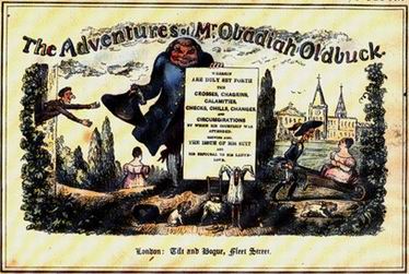
The earliest known comic book is called The Adventures of Obadiah Oldbuck published in 1837.
While the first animation film is Humorous Phases of Funny Faces from 1906 made by J. Stuart Blackton.
Although there were some elements of motion graphics in that first animated film including write-on effects and an intro similar to white-board animation, the first motion graphic work is arguably an experimental film named Anemic Cinema by Man Ray, Marc Allegrat, and Marcel Duchamp from 1926.
So comic books have 69 years of animation and 89 years of motion graphics as a medium. This isn't a history lesson but I think it's important to look at this topic in context. Being such an established medium I look to comic books for inspiration in entertainment, storytelling, image/iconography shorthand, pacing, character design, color, design, and illustration.
It's been around longer so the standards, practices, and techniques are more defined. Also, this should be obvious, I just like comic books.
Dead Earth and Lost Boy
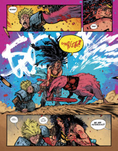
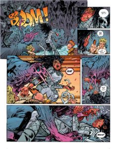
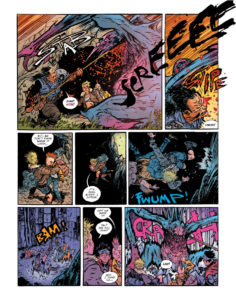
The first book I want to take a look at with comparisons to the motion design world is Wonder Women: Dead Earth (2020) by Daniel Warren Johnson with Mike Spicer (Color) and Rus Wooton (Lettering) published by DC Comics on their Black Label sub print.
The motion/VFX short film that it's reminding me of is Lost Boy by Ash Thorp from 2016 lostboyworld.com If you haven't seen Lost Boy, take 7 minutes to go watch it now (it won't let me embed it here) it's a great short sci-fi film. There are spoilers below, so you have been warned! For those of you that aren't familiar with Black Label, it's kind of like DC's Elseworld's tale but geared more for adults, meaning it's non-cannon and may have adult themes, swearing and more extreme violence and gore.
The basic plot synopsis is: "Princess Diana of Themyscira left paradise to save Man’s World from itself. When Wonder Woman awakens from a centuries-long sleep to discover the Earth reduced to a nuclear wasteland, she knows she failed. Trapped alone in a grim future, Diana must protect the last human city from titanic monsters while uncovering its secret of this dead Earth-and how she may be responsible for it."
"Lost Boy is an ambitious sci-fi concept heavily influenced by American action classics and Japanese samurai films. It instantly captures viewers with its highly visual and unparalleled sci-fi world. Year unknown. Population zero."
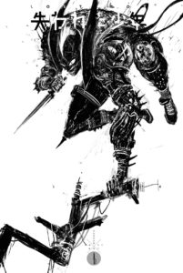
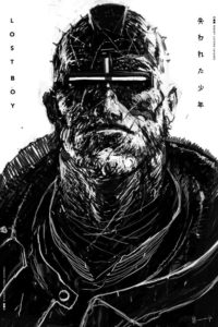
Obviously, there are some similarities to the dystopian theme, which is pretty common nowadays. Lost Boy took inspiration from Frank Miller's Ronin, Dark Knight Returns, and Otomo's Akira (both the comic and the film) as well as the cyberpunk visions of Terminator. For me, the storyboard of Lost Boy was key to revealing the stylistic similarities. The brushwork is in the same frenetic Sumi-styled rendering.
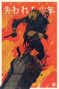
The color poster image from Lost Boy could easily be a splash page in Dead Earth. Now I'm not saying there's any idea swiping or plagiarism going on here, just that they are both probably drawing from similar wells.
Paul Pope and Rafael Grampa have done similar work and topics w/ Heavy Liquid and Mesmo Delivery respectively. (BTW if you interested in some inking advice from Paul Pope check this video ) The thing I'm loving in Dead Earth is the kinetic lettering by Rus Wooton.
It's incorporated into the panel in an interesting way with some subtle overlaps as if it traverses background to foreground. There's a lot of energy and real dimensionality to it.
The assumed protagonist in Lost Boy is a female punk, Xeh She's got a mohawk (a falling fin), she's wearing padded leather armor with spiky shoulder pads and dangling fighter wraps around her hands. She's running in slow motion through a desolate technological wasteland in the intro.
Every once in a while it cuts to real-time then cuts back in slo-mo, to emphasize the energy and urgency of the scene. In the last shot before we reveal the antagonist, we see massive rock formations greebled-out to the max, biomechanical in nature, with cables and cords running everywhere. It's a little bit like the junkyard wasteland that you see in the first Terminator film.
Then the antagonist is revealed and he's this cyborg dude with cyclops red visor with digital errata on the lens. It looks a little more like an Occulus Rift side than the Robocop helmet. He's stalking the young female punk. He's got a Terminator-style going on. He's got robotic arms, but also has some spikey pads and leather armor.
The twist in Lost Boy is a little weird and we find it out pretty fast, that antagonist is really the protagonist. It's really about this robot-killer thing(named Lost Boy in the credits) stalking, capturing, and destroying Xeh, who turns out to be an android/synthetic. He reaches through her face and kind of melts her skull and pulls out these glowing wires and circuitry.
We see her dissolve and sort of burn up and her ashen corpse is revealed. I'm not sure if that's Ash Thorp doing a little nod to his name or what. Then there are these red dots, which I assume to be Lost Boy vision/language, that is assimilating and building these glyphs and code.
Then lighting strikes the landscape and everything goes batshit crazy, and he feeds off here power ala Highlander. Then the Lost Boy just takes off on his bike and rides into the technological dystopian wasteland and the film ends. So really this is just a little vignette.
To me, it could be a comment on gamer culture or gamer-gate (which dates back to 2014, so it would fit with this timeline). But it's hard to say as the director only shows chase, strangle, crush, feed, escape. Watching it and rewatching it's hard to say if it's editorialized in any way. Except for maybe the title.
You could argue that the title makes the comment that gamer culture has lost its way by chasing women out. That might be a reach, and honestly, I'm not trying to re-ignite debate on the topic. To my knowledge, Ash Thorp has not commented on the theme or messaging of Lost Boy other than, “For me, LOST BOY is an attempt to get back to that child-like mind that would sit and draw worlds that live in my mind for hours on end. It’s a form of language for me both artistically and conceptually.”
This is where these concept shorts become problematic. What is the message, and why? If you are trying just to make a cool concept short, WTF are you telling this story? If you are taking a stance, why isn't it clearer? This is my main critique of Lost Boy, it's playing with dangerous imagery and not saying anything specific and intentional with it.
In contrast, Dead Earth is clearly about redemption, unity, and revolution. I've only read book one, so I don't know the full arc of the story, but it's easy to see there are some very strong savior-type themes going on.
No comments.