There is a range of different types of Movie Title Design Sequences, Opening Credits, and Intros that filmmakers and directors use in their projects. Each one has its own distinct reason for existence and the role that it plays in storytelling beyond just showcasing the credit. The art of the title sequence is really a lot of detective work figuring out the themes of the story and putting that into a framework or motif of imagery that makes sense and adds to the narrative without giving too much away.
13 Types of Movie Title Design Sequences
1. Telling more of the story. [Devil's Rejects] Movie Title Design
The movie The Devil's Rejects uses the end of its cold opener (or critical moment as it's often called) as its title sequence. We see the downfall of the Firefly family, shoot-out, the bust, the arrest, the escape, and on the run. This title sequence sets up the entire movie and also acts like "a story thus far" if you haven't seen House of a Thousand Corpses. Devil's Rejects is the sequel to House of a Thousand Corpses, continuing the murderous exploits of the Firefly family. The title sequence's purpose is to catch the viewer up to speed at the same time as thrusting us into the middle of the action. It explains in a way that the viewer understands what's happening and becomes engaged and drawn into the movie.
This title sequence uses montage and freezes frames with text as a throwback style to the 70's which director Rob Zombie drew lots of inspiration for this horror franchise. The Song "Midnight Rider" By the Allman Brothers sets the tone for this southern-fried outlaw film (with horror roots). Here the credit sequence does a lot of heavy lifting. It catches us up on all the important aspects of the story, sets the tone and gives the reason for them being on the run, and even sneaks in a kill. It's a short film within a film; economical, useful, and engaging. This style is not going to work with every film, but when it does, it can really make an impact on the audience.
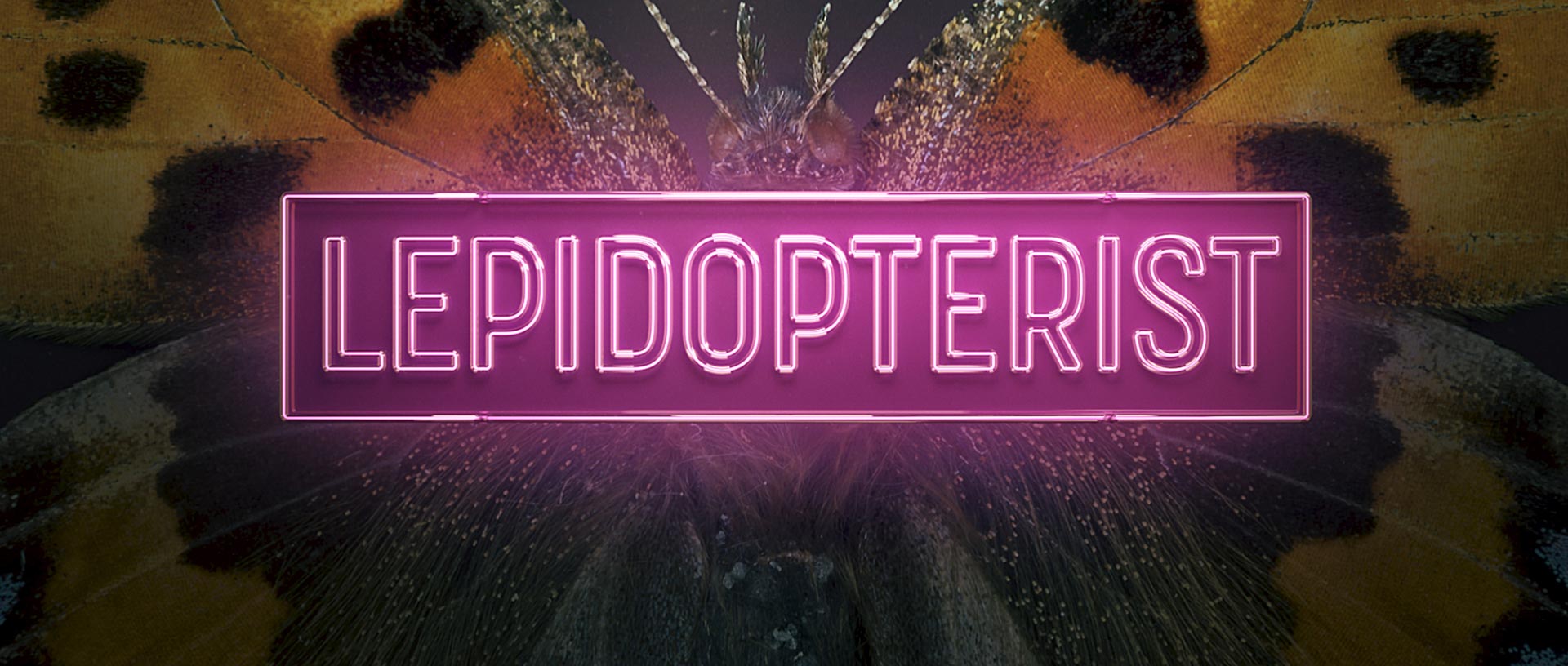
2. Textural Evidence [Seven] Movie Title Design
Kyle Cooper's titles for Seven are legendary for inspiring a generation of title designers. This was the first time that a documentary style was used for these kinds of titles. This sequence does a phenomenal job of setting a somber, horror-like tone for the film, as well as giving the audience a preview of what's to come.
The first thing that jumps out is the messy, scratchy font. Then, we realize everything is in shadow. The quick cuts become more intense as the pace gradually picks up and the NIN soundtrack becomes more chaotic. At first, notebooks and words. Then, developing photos and film, and crossed out faces. That's when the soundtrack intensifies, and we see it all coming together. The flipping of pages of crime after crime. The hand sewing of the notes and images into one book by anonymous, bloody and bandaged fingers. This is a serial killer's diary, and they are not to be messed with.
This style is great for anything crime-related but also can be great for horror movies or anything with a lot of collateral and items that are significant to the story.
We used a combination of this style and Close-Up for the title sequence we did for Lepidopterist.
3. Character Roster [Snatch] Movie Title Design
Guy Ritchies' Snatch title sequence uses smash zooms, speed ramps, spins, and cuts like his editing/shooting style. Title Cards that look like Boxing Card promos introduce the characters in freeze frames. Character vignettes hint at their role in the film and in this London gangster underworld. The sequence is all about the characters. No actual credits, just character names, so it's more about identifying roles and storytelling. It also serves the purpose of setting up the fun tone and mood of the film.
Breakbeat music w/ a "walking" jazzy bass line keeps the sequence energetic while adding a bit of suspense. This inspired many heist films that followed and used (and continue to use) this kind of music.
Character roster is great for any ensemble type of movie when you have a lot of characters and really need to introduce them in a fast and memorable way.
4. Joyride [Birds of Prey: And the Fantabulous Emancipation of One Harley Quinn] Movie Title Design
Birds of Prey title sequence is a joyride through some of the elements and themes of the movie. It's a closing main title at the end and just highlights how much chaotic fun the viewer had while watching the movie. It sums up the film's themes with its trippy, messy, bold aesthetic. These main themes are female empowerment and success.
This title sequence is a virtual funhouse tour, from the surrealist art to the way the camera moves through it. The color palette is similar to those used in pop art, and putting 2D images into 3D space is a perfect way to showcase the hand-drawn illustrations.
Joyrides are great for end-on titles for any superhero type film or comedies when you are trying to remind the audience of the ride they were just on so they can leave the theater on a high.
5. Metaphor [Swamp Thing TV Show] Movie Title Design
Drowning, death, growth, rebirth... the Swap Thing opening tells us this story with metaphors throughout its duration. We don't see anyone struggling, dying, or being resurrected, but we know this is what happens through the implication of the different scenes. This title sequence serves the purpose of a prequel, so we may not know who this person is, but we know the events that led to their transformation, which gives the series room to reveal the details gradually throughout the episodes.
The tone and setting are established within the first two shots. This is a mystery taking place in a forested area, probably in a small town with not much of a population. The familiar gesture of a hand falling to the ground is used to signify death. The eyes and pupil allude to transformation, and so do the blood vessels which give us more information about the setting of this series as they transform into a vague map. Metaphors to death and destruction are plenty, with a whole house and car being submerged in the water and the playing card with images of death and authority, so a power struggle. The blood vessel-like vines weave their way through to the end of the sequence and brings it full circle.
Metaphors title sequences convey complex plotlines and arcs while establishing tone and mood.
6. Symbolic [Six Feet Under] Movie Title Design
Death. The symbolism is all over this title sequence. We see multiple crows throughout, heavenly clouds, and white Lilys dying. Loss. Hands letting go, the quickly disappearing silhouette of a man in a tunnel. These are all symbolic of the show's underlying themes. Even the typeface contributes to the tone, with its serifs and formal appearance. The text is also kinetic in some shots which gives it a dynamic feel. For example, the text is tracked to correspond with embalming fluid levels. It's all unified with lots of match cuts and camera moves as the imagery transitions.
Less is more is the mantra w/ Symbolic Movie Title Design sequences. You don't want to be too on the nose and literal, so being symbolic can give power to the themes and tap into the collective unconscious. It can make the work seem bigger than just this story.
"On one level, the show is a conventional family drama, dealing with such issues as interpersonal relationships, dysfunction, infidelity, personal growth, and religion. At the same time, it is distinguished by its focus on the topic of death, which it explores on personal, religious, and philosophical levels. Each episode begins with a death, the cause of which ranges from heart attack to murder to accidental death or sudden infant death syndrome. That death usually sets the thematic tone for each episode, allowing the characters to reflect on their current fortunes and misfortunes in a way that is illuminated by the death and its aftermath. The show also uses dark humor and surrealism throughout its seasons.'
7. Setting Tour [Sorprano's, Waynes World] Movie Title Design
The Sopranos opening credits starts w/ “Woke Up This Morning” performed by Alabama 3. "Woke up this morning and got yourself a gun." Immediately you know this is going to be a violent show. We tour the gritty areas along the New Jersey Turnpike as Tony Soprano is going about his day driving and smoking a cigar. The tour of the scenery is vlog-like, coupled with closeups of Tony, never fully seeing his face except at the end when parks and gets out of his car. He passes grimy bridges, swamps, industrial parks, construction yards, and cemeteries.
With each location Tony passes, questions emerge in the minds of the audience. Is he driving from crime to crime? Is this where bodies are buried? What is his ultimate destination? This sequence does a good job of keeping the audience intrigued. Finally, he drives by some local pizza joints, stores, and houses and then pulls up to his private driveway and parks his SUV in front of his mansion. The Sopranos logo slides in from either side (noticeably the "r" in Sopranos is a gun), and the sequence ends.
On the flipside, Waynes World takes us through famous cultural settings in Chicago that locals know and love. The Car Spire, Cigar Store (now Eye Store) Indian, Western Ave. Car Lots, Scathell's, Chicago Joes, White Castle, and ending with the fictitious Stan Miktas's donut shop. All the while Wayne and his friends sing along to Bohemian Rhapsody as they cruise through the city. Pure joy and love for the city.
Setting Tours are great for giving authenticity to a story where its local population might be tuning in. It's like insider information that people from the area can look at and say "Hey, I know that spot". It can foster goodwill and loyalty to the story before it even begins.
8. Shape Language [Queen's Gambit] Movie Title Design
This sequence is immediately reminiscent of 1950s and 60s graphic design, in addition to the added grain on top of everything which gives it an old-school, vintage feel. The squares represent the grid of the chessboard, they are dancing and choreographed in sophisticated patterns.
"Squares and rectangles suggest conformity, peacefulness, solidity, security, and equality. Their familiarity and stability, along with their commonness can seem boring. They are generally not attention getters, but can be tilted to add an unexpected twist."
Patterns that merge and morph into others. These patterns and movements seem inspired by John Whitney and other early computer animation innovators. Everything is calculated and angled, including the san serif font credits which are boxed in uniform rectangles. Even the Russian Classical music has an edge to it. This is of course inspired by the layout of a chessboard, as the game is a theme and the main driving force of the series. Circles briefly come into play to counterbalance and represent the human side of the show, but even they form squares eventually.
Using Shape Language in a Movie Title Design is one thing, and base-ing it solely on that is another. It can be quite powerful if it's tied to an element in the story like it's done here, and even more so if the theme is connected to the symbolism of the shape (also here).
9. Prop Focused Motif[Casino Royale] Movie Title Design
As the title suggests, this film revolves around gambling. So what better object to create a whole animated world based on than playing cards? The sequence begins of course with the classic Bond target opening. Almost immediately after it transforms. Diamonds, Clubs, Spades, Hearts, and Aces form a kaleidoscope of patterns and spirals. Jacks, Queens, and Kings participate in the action. There's an almost surreal feel to it, from the giant hand plucking a spade to the shapes branching out from pistols like beautiful snow fractals. Then begins the killing. Victims explode into card shapes like hearts and diamonds when they are shot, stabbed, fall to their deaths, etc. The battleground, people, and even bleeding blood vessels are all tied to playing cards.
Prop Focused Movie Title Design sequences are great for action movies filled with McGuffins, exotic weapons, or anything else where the movie is just centered around a very visually interesting prop.
10. Animated/ Illustrated Cartoon [Grease, Pink Panther] Movie Title Design
Grease's title sequence is all about the pop culture of the 50s. Slob's rule, rebellious teens, cliques, cruising, car culture, and drive-ins. It's like a Mad Magazine come to life. The fads and culture of the era are illustrated in an animated title that demonstrates the energy a live-action sequence can't. The opposing styles of the leads, John Travolta's character vs. Olivia Newton John's, is like Mad Magazine vs. Disney. A typical teen slob with attitude and a beautiful princess surrounded and loved by woodland creatures. Mad magazine and Playboy strewn about. And let's not forget the theme song, the music, tone, and comedic vibe are all spelled out for us before we see any of the actors.
Pink Panther's title sequence is famous for Henry Manci's theme music and the animation of the Pink Panther being a devious thief. The audience gets a light-hearted feel from the various random gag scenes; the Pink Panther getting pulled from conducting an orchestra, getting a photo taken that turns explosive, taking a Venice canoe ride, and getting wet.
The sequence is like a short, coming on before the film, displaying the credits while entertaining. The Pink Panther interacts with the text in a playful way, even painting his own at some point. Sometimes the text even strikes back. The text, framed in solid color backgrounds, animates on in playful ways. In the end, a large part of the purpose of this sequence is to establish the rules for the Pink Panther world. It's a heist comedy. A farce. No real violence or harmwas done. It aims to entertain at a more all-ages level.
Animated and Illustrated Cartoon movie titles can be great for all ages movies or anything that's trying to just be playful and have some fun.
11. Abstract [Psycho] Movie Title Design
I don't think you can write about title sequences without writing about Saul Bass. His titles for Alfred Hitchcock's Psycho are abstract, harsh fragments and slices are coming together and being pulled apart. Grey blocks are animated horizontally or vertically with white text on a black background. It's rather basic, but the soundtrack by Bernard Herrmann and the London Philharmonic Orchestra does some of the heavy lifting. It's violent, harsh, and menacing with just a hint of romance or fantasy. It sets up the viewers' expectations with a sense of mystery and dread. You know something serious is coming.
Abstract Movie Title Design excels at conveying tone, mood, and sophistication. It primes the audience for a deep dive into the unknown.
12. Close-up [Casino] Movie Title Design
Another Saul Bass title! This one literally starts with a bang as the character Sam "Ace" Rothstein gets blown up by a car bomb and goes hurtling into space. Then it smoothly transitions to close-ups of Vegas lights as Ace's body continues to float in and out of view. Somber operatic music plays in the background as white titles fade up over the dancing lights and in-camera double exposures. The music really sets the tone, without it, the sequence would definitely lose the serious, somber setting. The bulk of the titles is this abstraction and macros of Vegas lights, then the falling "Ace" fades in and the sequence ends in flames.
Close-up and macro titles offer a myopic and somewhat claustrophobic experience. You can't pull back to get the full picture and are just all up in the imagery to an almost uncomfortable degree. It can put the audience on edge to get ready for an unsettling story.
13. 3D Camerawork [Pacific Rim] Movie Title Design
The main on-end title for Guillermo Del Toro's Pacific Rim, created by Kyle Cooper's Production Company Imaginary Forces with Miguel Lee as the Creative Director, dazzles and delights. This makes heavy use of 3D camera work across gorgeously rendered models. White sans serif type with a metal effect and techno flourishes deliver the main credits. Black shiny metal Jaegers showcased in close-up detail. We see all the camera tricks. Rack focus as transitions. Rotating camera views and speeds ramps to broken debris particles. Rotating around tanks, worm's eye view, and helicoptering camera moves. Kaiju's reverse pedestal shot, which then pulls out and ends with a group shot of the Jaegers. The titles are almost dizzying. The goal is to convey detail, scale, and size with camera work, this sequence does a good job of that.
These kinds of 3D Camerawork Movie Title Design sequences are great big VFX & CGI-heavy blockbusters. Anything where there are a lot of 3D models to just fly around and examine.
https://www.artofthetitle.com/title/pacific-rim/
By Bayan Jarad and Jerry Nelson

No comments.